Wednesday, July 16, 2008

Interactive Graphics: Phases of the Moon

Sometimes, and animation can be used to explain or illustrate a process, or demonstrate how something that changes over time actually 'works'.

Where the animation is made interactive, this allows the audience to engage with the explanations, 'ask questions of it' and test out their own hypotheses or questions about how things might change in a particular situation.

For example, the following screenshot is taken from an interactive application that demonstrates how the different phases of the moon appear to come about:

Phases of the moon interactive ( http://highered.mcgraw-hill.com/sites/007299181x/student_view0/chapter2/lunar_phases_interactive.html )

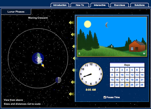
You can try out the interactive animation here: Astronomy: Journey to the Cosmic Frontier (Mcgraw-Hill) interactive: "Lunar Phases Interactive".

Even though no textual explanation is given about how the different phases of the moon appear to us on earth, do you think you could provide an explanation of the effect simply based on the above graphic? What explanation do you think the image provides, and how does the graphic manage to communicate it? Do the elements of animation and/or interactivity help to explain the effect 'in more detail', and if so, how?

Saturday, July 12, 2008

Social Visualisation of Baby Names

In A Round Chart in a Square Hole - Stacked Bar Charts, I showed how several data points could be plotted on top of each other in a variant of a bar chart known as a stacked bar chart.

Another bar chart variant - a grouped bar chart - can be used to compare data from different classes, and at different times, as this example shows:


Try to find a data set that can be sensibly visualised using a grouped bar chart, and create a chart with that data using the Google Chart Generator or within Google Spreadsheets or another online service.

If you found a data set that included several related classes of data collected over many dates, you might find that there are too many bars that can be grouped sensibly.

In this case, it might be useful to be visualise the data using a technique that allows for stacked data to be represented using a stacked line graph.

The Baby Name Voyager provides an interactive example of just this approach.

http://www.babynamewizard.com/voyager#prefix=JA&ms=false&sw=f&exact=false

Visit the Baby Name Voyager website and have a play with it. As you do so, try to identify what the underlying data set might be, how it is visualised, and what sorts of interactivity are described. When this website was first released,. it was very popular and attracted a large number of visitors. What different reasons can you think of for why anyone would want to explore the name data using the name voyager?

Now read the following paper about the Baby Name Voyager by its creator, Martin Wattenburg, and see if you can answer the questions that follow below: Baby Names, Visualization, and Social Data Analysis.
  • What prompted Wattenburg to create the visualisation?
  • Where did the data come from?
  • How is the data visualised and what sort of interactivity is provided?
  • In your own words, how does Wattenberg describe the notion of "social data analysis"?
  • What sorts of "role" does Wattenberg suggest people fall into when socially analysing the data?

Wednesday, July 9, 2008

Satellite Coverage Maps

Just after I put together the post on Visual Teaching - GPS Satellite Constellations I came across a site that displays live satellite tracking on a map:

Live satellite tracking http://www.n2yo.com

The site allows you to track particular satellites, or view satellites that are in your particular bit of sky...

Even if a satellite is in line of sight with your location, however, it doesn't necessarily mean that you can get a signal from it. Many of the antennae on a satellite are directional. The rather wonderful SatBeams website shows actual satellite coverage maps for a selected satellite:

Satellite coverage maps - http://satbeams.com

Where does SatBeams claim to get its data from? Is this a trusted source? Does the satellite tracking data site offer any explanation of where it gets its data from, and if so, how does this compare with the SatBeams site?

How can visitors to the Satbeams site particpate by contributing data back to it? In what ways might this user contributed data add value to the site or detract from it?

As well as satellite locations, it's also possible to find locations for other transmitters. For example, here's a geo-referenced list of UK television and radio transmitters.

(If you come across any related lists, such as a list of UK mobile phone cell masts, please post a link in a comment to this post:-)

Friday, July 4, 2008

Creative Mapping

Most people are familiar with the idea of maps as representations of geographical information, and making judgements about distances between places, climate, and maybe even cultures as a result of where they are on a map.

By reading particular map features - such as mountain ranges, uncrossable rivers, jungles and oceans - we also get an idea of how much effort might be involved in crossing a particular sort of terrain.

So how about using maps to tell a different sort of story, such as how close different businesses are in cultural terms?


Here's a 'regional' map...


Or how about this map of a city?


How effective are these maps at implicitly communicating some sort of story about what they depict? For example, how is DRM (Digital Rights Management) or Microsoft depicted in "The Web is Agreement"?

Each of these maps can be used to tell a story. For example, here's a walkthrough of a social entrepreneurship landscape:


The social entrepreneur landscape from David Wilcox on Vimeo.

How are geographical features used in the social entrepreneurship landscape to bring alive the relationship between, or roles played by, different social entrepreneurs and socially minded organisations?