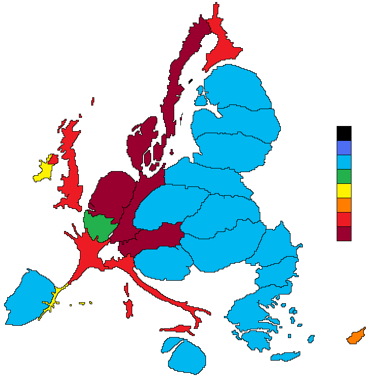
What do you call th[e] kind of [map] projection, where country size is proportional to a variable?
What do you call something like this, for example?

Any ideas? How would you search for it?
I started off for a search on "proportional country map", and was lucky enough to soon hit upon an explanation by scanning through the search results: this type of map is called a cartogram, and it's one of several ways of using a map to depict the value of some particular measure or statistic.
Visit the Worldmapper website, which hosts a collection of several hundred different cartograms (some of which are reprinted in The Atlas of the Real World: Mapping the Way We Live) and see if you can find cartograms that estimate the distribution of telephone lines across the world towards the end of the 20th century and in the early years of the 21st century. What caveats are provided about the data used to draw the map? Do you find that you can make sense of the cartogram? How effectively does it communicate to you the relative distribution of telephone lines across the world? What data values are actually being visualised? What data values might have been visualised? How important is the selection of the data set for making a 'sensible' cartogram?
As well as cartograms, there are several other ways of visualising data overlays on a map. In Feel the Heat, I described how heat maps should be used to show the density of a particular measure over particular areas of a map by using a continuous, semi-transparent map overlay. (Geographical heat maps are often isopleth maps, where the different colours border on an "isobar" value or contour line: one one side of the line, the value is higher than the cotour line value, on the other side, it is lower.)
Two other popular techniques are widely used to associate more 'discrete' data values with either administrative areas (counties, states, and countries, and so on) or particular locations.
Choropleth maps
Choropleth maps use shading or different colours (often along a spectrum) to colour different well defined areas of a map. The Many Eyes World Map provides a quick and easy way of plotting choropleth maps.
Proportional Symbol Maps
Proportional Symbol Maps,or more often Proportional Circle Maps associate a particular symbol, typically a cricle, with a particular point on a map, such as the centre of a city, or the capital city of a country. The diameter of the circle is then some function of the quantity being visualised. The Many Eyes World Map can be used to create proportional circle maps, as can the map maker tool on Goecommons.com.
One of the useful features of the Worldmapper site is that it makes the data that was used to create the cartograms available, which means that you can download and visualise it for yourself using whatever mapping tools you have available. Download the small Excel spreadsheet containing the data for the most recent telephone lines distribution. Open the spreadsheet file, select an appropriate set of data, and upload it to Many Eyes. Once it is uploaded, create appropriate choropleth and proportional circle map visulisations of it. Which mapping technique do you find more powerful, and why? The choropleth map, the proportional circle map or the cartogram?
See also: Perceptual Scaling of Map Symbols (from the making Maps: Digital Cartography blog).
PS you can create you own choropleth and proportional symbol maps using a variety of UN data sets, in a browser, at StatPlanet.