For example, the following map shows a density map of where to find pizza in the US city of Boston.
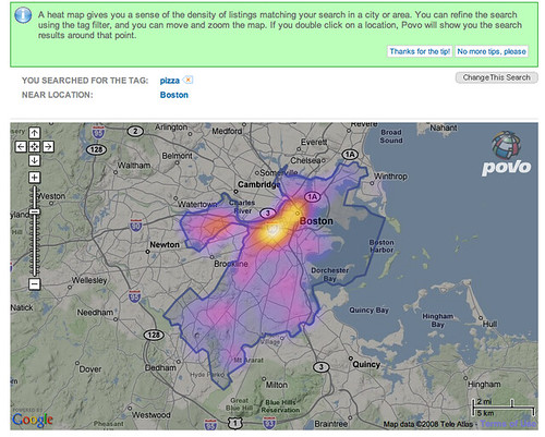
The 'hot' colours are naturally taken to mean areas where there is a high density of pizza outlets (!), and the 'cooler' colours mean a lower density, or incidence, of such establishments.
(If you would like to create your own 'heat map' overlays on Google maps, this Googhle Heat map library may help, though you will need a certain amount of programming ability in order to use it!)
Density maps have come to be widely used for plotting the incidence of crime within city confines, particularly in the larger US cities. See if you can find any examples of such 'crime maps' and post a link back to them in the comments to this post.
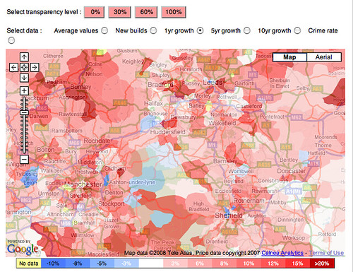
There can also be useful when house hunting - for example, the following Mouseprice house price heat map shows house price inflation in the north of England over between May 2007 and May 2008.
And as if that wasn't enough, several application are now starting to appear that perform population tracking by tracking people's mobile phones (Using Mobile Phones for Time & Motion Studies). This information can then be displayed back to people via their mobile phones so that they can see where the 'hot' places to be are: Citysense: where is everybody?.
As well as being used as overlays on geographical maps, density maps are also widely used to provide reports about website usage. Information can be collected at a crude level based on the links that users click through on a web page to produce a click density map, although it is possible to also track mouse cursor movements, or, in a laboratory setting, eyetracking data.
The following graphic shows the result of aggregated eyetracking data collected from multiple users of the Google website. The hot spots are the places on the page where the users were looking at most.

(Find out more about how the data was collected: Enquiro Develops Google’s Golden Triangle and Eyetools, Enquiro, and Did-it uncover Search's Golden Triangle.)
If you would like to create a click density map for a website you control, there are several services you can try for free. For example: ClickHeat, Crazy Egg and clickdensity. How might heat maps help you improve the usability of a website?
As well as being understand user navigation behaviour on websites, eyetracking heatmaps can also be used to understand better how people read from the screen.
Read F-Shaped Pattern For Reading Web Content. What do the eyetracking results suggest about how people read web pages? How does the visualisation make this behaviour apparent?
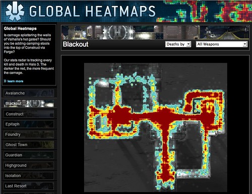
As well as reporting 'real world' data, density maps can also be used to visualise the occurrence of events in virtual worlds. For example, online game distributor Bungie provides density maps for the game Halo 3, showing where the 'kill zones' are on various game levels, as measured by the numbers of players who 'died' in each location
How might this sort of visulisation help game designers improve the playability of their games? What other visulisations might be able to help game designers better understand player behaviour within their games? Write down your ideas, and then see how they compare with what actually happens, as described in this article from Wired magazine: Halo 3: How Microsoft Labs Invented a New Science of Play.
No comments:
Post a Comment