In Moving from Bar Charts to Histograms, we saw how the graphical form used to display a bar chart could also be used to illustrate a continuous data set.
In many cases, however, it is more appropriate to use a 'line chart' or 'line graph' to display a set of continuous data, such as the value of a particular quantity as it changes over time.
For example, the following chart shows how the volume of people searching Google for different terms over a period of time using the Google Trends service:
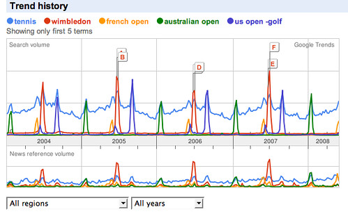
What does the above chart tell you? (Ignore the labels A-F). What story does the chart tell you about the annual tennis calendar?
Read this OpenLearn section on line graphs: Line Graphs (from More working with charts, graphs and tables). Why is Google Trends chart not necessarily a good example of how to present a line graph?
Now read through activities 5 and 6 from the same unit: Line graphs: Activities. Activity uses a
Use the Google chart generator to display the charts, or copy the data into a spreadsheet and use a chart tool to create the line graphs. You will need to use a different approach for each chart. For example, in the Google Chart generator, you should use an "x,y line graph" for Activity 6 and you could "line graph" for Activity 7. Can you explain why?
