As you work through the following two readings, see if you can answer the following questions:
- What sort of story does a pie chart tell?
- Under what circumstances is it appropriate to use a pie chart? When should a pie chart not be used?
- How do you construct a pie chart from a set of tabular data?
How do you read a pie chart? Read the following section from the OpenLearn unit "Working with charts, graphs and tables": Making sense of data - Pie Charts.
When should you use a pie chart, and how do you construct them? Work through the following section from the OpenLearn unit "More working with charts, graphs and tables": Pie Charts.
How can I create My Own Pie Chart?
Pie charts can be created within most, if not all, spreadsheet applications. However, because pie charts only tend too contain a small amount of data, you may find it quicker to use a simple online chart generator.
For example, several chart generators exist that can create a pie chart using the Google charts web service. This service takes the data that is to be plotted in a chart, along with the chart title and labels, in a single URL, and returns an image that plots the data. The URL can be created automatically from a table containing the data, as these two examples show:
It is also possible to create charts on a web page dynamically (that is, automatically) from data contained in a table. The following embed charts that are created by passing data via a URL to a chart generator, which returns the chart image that is embedded in the web page:
- Generating charts from accessible data tables using the Google Chart API
- Automatic conversion from simple, accessible data tables to YUI Charts
- Creating accessible charts using canvas and jQuery
Creating Pie Charts in Google Spreadsheets
As with most spreadsheets, a pie chart can be created by highlight two coloums (or rows) from a spreadsheet; one should contain the labels for each segment of the pie chart, the other should contain numnerical data. A pie chart wizard will then typically calculate the proportional sizes of each category and plot the chart accordingly.
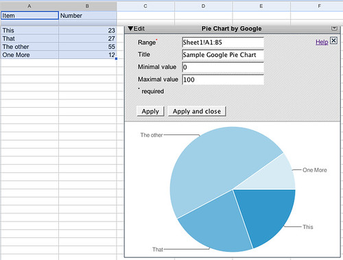
The following widget shows a pie chart created 'in real time' from data contained in a Google spreadsheet:
If the data in the spreadsheet is changed, the pie chart will change accordingly next time the widget is refreshed, or the page containing it is loaded.
Creating Pie Charts in Excel
If you are an Excel user, there are plenty of tutorials available on how to create a pie chart using that application. try searching for "pie chart in excel" using the How Do I? instructional video search, or check out this video (one of many) on Youtube: How to create a pie chart in Excel.
No comments:
Post a Comment