If you are ever in the market for buying a house, it's likely that whenever you get the details for a property it will include at least a 2D hand-drawn sketch of the floor plan of the house.
However, it's increasingly likely that a more professional looking floor plan will have been created using a CAD (computer aided design) floor plan editor, such as the Autodesk labs online drawing tool. (It's possible to share such drawing over the web , so if you have a go at using the Autodesk Labs Draw package to draw a floor plan, please post a link back to it in the comments to this post :-)
2D floor plans are all very well, but there is also an increasing number of tools that make 3D modeling, a technology once only available to professional architects, now available to all-comers.
For example,, SketchUp is a 3D design tool that can be used to create 3D models of buildings (as well as other objects). SketchUp models can be displayed in Google Earth and used in other 3D web applications and virtual worlds.
SketchUp works on Mac and Windows computers and can be downloaded from http://sketchup.google.com/.
It is also possible to model - and view - objects inside building that you have created, as well as creating the buildings themselves.
In true collaborative style, you can share and edit the designs that other people have created by checking them out of the 3D Warehouse.
One very powerful feature of SketchUp is the ability to use a photograph as the basis for a model, as the following movie illustrates:
Download Google SketchUp and have a go at creating your own 3D model. There are lots of video tutorials to help get you started on both the Google SketchUp website and on YouTube. When you have completed your model, why not upload it to the 3D Warehouse, or post a movie of a walkthrough of your model to a video sharing site, with a link back here? :-)
Once you have created a 3D SketchUp model, it can be submitted to the Google Sketchup 3D model warehouse, and then viewed in 3D worlds such as Google Earth. Online applications such as Scenecaster also allow you to reuse models from the SketchUp warehouse as part of an animated 3D walkthrough, as this movie shows.
If you are interested in using SketchUp to create 3D models from 2D floor plans, this set of tutorial videos will show you how:
(Note that if you use the Autocad Labs Draw application cannot directly export drawings in a CAD format that SketchUp can import. However, you can export the plan as an image and load that into SketchUp, where you can trace round it.)
If you do manage to create a 3D model from a floor plan, why not post a link back to the original 2D CAD drawing, and the 3D model you generated from it, as a comment to this post?
Saturday, June 28, 2008

Monday, June 23, 2008
Visual Teaching - GPS Satellite Constellations
When I set up the visual gadgets blog, the intention was to use it to draft out a set of materials about data visualisation. So how about this: visualising data about GPS satellite locations...
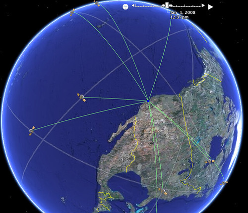
The above image is taken from a visualisation using Google Earth, as described here: Interactive Spiders and Charts. The visualisation also supports an animated view, showing the motion of satellites over a 24 hour period. It's particularly interesting to watch how different satellites come in and out of view of a particular location.
To view the visualisation in Google Earth, Add the following Network Link in Google Earth: GPS Satellite constellation. (If I get a chance, I'll try to put together a page that works in the Google Earth browser extension, and maybe uses Milton Keynes as the focus? An interesting exercise would be to let the user create the KML file that visualises satellites in view for their own location...)
The following movie describes how the GPS system works:
To learn more about GPS, HowStuffWorks has a good intro to How GPS Receivers Work, but for a more detailed view, check out the MIT opencourseware courses GPS: Civilian Tool or Military Weapon? and Modern Navigation.
The above image is taken from a visualisation using Google Earth, as described here: Interactive Spiders and Charts. The visualisation also supports an animated view, showing the motion of satellites over a 24 hour period. It's particularly interesting to watch how different satellites come in and out of view of a particular location.
To view the visualisation in Google Earth, Add the following Network Link in Google Earth: GPS Satellite constellation. (If I get a chance, I'll try to put together a page that works in the Google Earth browser extension, and maybe uses Milton Keynes as the focus? An interesting exercise would be to let the user create the KML file that visualises satellites in view for their own location...)
The following movie describes how the GPS system works:
To learn more about GPS, HowStuffWorks has a good intro to How GPS Receivers Work, but for a more detailed view, check out the MIT opencourseware courses GPS: Civilian Tool or Military Weapon? and Modern Navigation.
Judge Every Book By Its Cover...
A new visual front end to the Amazon online bookstore (made possible via the Amazon API) provides a user interface to the store reminiscent of a 'real world' bookshop: Zoomii.
Watch the following video, or visit the Zoomii website. What elements of a 'real world' bookshop does Zoomii try to replicate?
How else might 'real world' metaphors be used to enhance visual shop displays?
One way may be to overlay books on a floorplan/map view, using an approach similar to this interactive office plan.
Watch the following video, or visit the Zoomii website. What elements of a 'real world' bookshop does Zoomii try to replicate?
How else might 'real world' metaphors be used to enhance visual shop displays?
One way may be to overlay books on a floorplan/map view, using an approach similar to this interactive office plan.
Tuesday, June 17, 2008
Visual Recipes
Most people are familiar with the structure of a recipe in a recipe book: a list of ingredients is given, maybe with a cooking time/temperature, followed by a set of 'assembly' instructions for the recipe.
But how about this novel summary table for a recipe from the Cooking for Engineers website? (Cooking for Engineers?! Hear the rationale behind the site from its creator, Michael Chu: Geek Cooking, Debunking Hollywood Science and Green Roofs.)
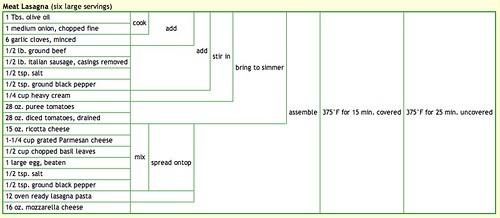
How does the structure of the table convey "process information" - that is, what steps to take with what ingredients in what order?
Dig out your favourite recipe, and see if you can represent it using the tabular layout, then upload a screengrab of the table and add a link to it as a comment to this post :-)
But how about this novel summary table for a recipe from the Cooking for Engineers website? (Cooking for Engineers?! Hear the rationale behind the site from its creator, Michael Chu: Geek Cooking, Debunking Hollywood Science and Green Roofs.)
How does the structure of the table convey "process information" - that is, what steps to take with what ingredients in what order?
Dig out your favourite recipe, and see if you can represent it using the tabular layout, then upload a screengrab of the table and add a link to it as a comment to this post :-)
Friday, June 13, 2008
Visual Thinking Tools
Sometimes, just laying arguments or ideas out in a spatial way can help you see gaps in an argument, or can help you 'walk through' a decision in a structured way (for example, de Bono's "Six Thing Hats®" provides a visual metaphor for considering the different sides of a situation in a decision making process.
Exploratree is a web site that collects together 'visual thinking' templates that can be used to help structure thinking in a visual way.
Visit Exploratree and browse through some of the "thinking guides" that are collected there. See if you can find a thinking guide that would be appropriate for helping you think through the consequences of an action, or "planning back" from some anticipated goal to a current situation. How does the template for a simple exercise such as Plus, Minus, Interesting help you actually perform this exercise? Do the templates require any prior knowledge, or does their visual design implicitly suggest how to use the thingin guide without further instruction? For example, how would you use this template? Compass Rose.
Exploratree is a web site that collects together 'visual thinking' templates that can be used to help structure thinking in a visual way.
Visit Exploratree and browse through some of the "thinking guides" that are collected there. See if you can find a thinking guide that would be appropriate for helping you think through the consequences of an action, or "planning back" from some anticipated goal to a current situation. How does the template for a simple exercise such as Plus, Minus, Interesting help you actually perform this exercise? Do the templates require any prior knowledge, or does their visual design implicitly suggest how to use the thingin guide without further instruction? For example, how would you use this template? Compass Rose.
Market Share - But What's Changed?
I can still remember the first time I saw a treemap - it was in a blog post by book publisher Tim O'Reilly on the Book Sales as a Technology Trend Indicator.
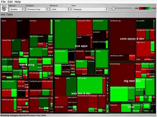
The above treemap shows, at a glance, two sorts of information. Firstly the relative size of the market for different categories of computer books (O'Reilly is one of the best known computer book publishers) - the area of each rectangle reflects the relative sales volume of books in one category compared to the others. Secondly, the chart shows the year on year change in the volume of sales per category by using the dimension of colour.
Do a web or blog search for "State of the Computer Book Market" to find the most recent O'Reilly review of the computer books market. Visit the review page, but before reading the commentary, just look at the treemaps that are presented, and write your own conclusions about what they say about the state of the market. Then read through the commentary and compare the conclusions to your own. How 'intuitive' is the treemap to read?
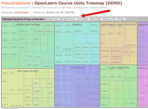
Treemaps are also a great way to explore hierarchically organised data. For example, the following image shows a screenshot from the IBM Many Eyes visualisation service, where I have used a treemap to represent some of the free course units offered by OpenLearn. The uploaded data includes OpenLearn course unit identifiers, the OpenLEarn subject area the units are affered in, the original OU course from which the units were derived, and so on. By rearranging the order of the headers, the treemap can be used to create different hierarchical views over the data.
Visit the OpenLearn Units Treemap (requires Java) and familiarise yourself with how the treemap works. See if you can find any other good examples of treemap visualisations on Many Eyes, and post a link back to them as a comment to this post.
You can also find treemaps as elsewhere on the web. For example, diggGraphr provides a treemap view of new and upcoming stories on the Digg social news site, and is itself reminiscent of this original news map. One of the most compelling treemaps I have found is the Hive Group World Population treemap, which uses data from the CIA factbook to provide a highly intereactive way of exploring world population data.
Read the following Many Eyes description page about Treemaps.See if you can create a treemap from your own data set, either one of your own, one you have discovered on Many Eyes, or one you have located elsewhere. (Take care uploading data to Many Eyes - if uploaded there, it will be made public.)
As well as the 'simple' treemap, Many Eyes can also be used to identify changes in data values in a way reminiscent of the treemaps used in the O'Reilly 'State of the Book Market' reports, using the "Treemap for comparisons" (sometimes referred to a s "change treemap") visualisation.
See if you can find any examples of "change treemaps" on the Many Eyes site, or create your own visualisation of that type using an appropriate data set.
The above treemap shows, at a glance, two sorts of information. Firstly the relative size of the market for different categories of computer books (O'Reilly is one of the best known computer book publishers) - the area of each rectangle reflects the relative sales volume of books in one category compared to the others. Secondly, the chart shows the year on year change in the volume of sales per category by using the dimension of colour.
Do a web or blog search for "State of the Computer Book Market" to find the most recent O'Reilly review of the computer books market. Visit the review page, but before reading the commentary, just look at the treemaps that are presented, and write your own conclusions about what they say about the state of the market. Then read through the commentary and compare the conclusions to your own. How 'intuitive' is the treemap to read?
Treemaps are also a great way to explore hierarchically organised data. For example, the following image shows a screenshot from the IBM Many Eyes visualisation service, where I have used a treemap to represent some of the free course units offered by OpenLearn. The uploaded data includes OpenLearn course unit identifiers, the OpenLEarn subject area the units are affered in, the original OU course from which the units were derived, and so on. By rearranging the order of the headers, the treemap can be used to create different hierarchical views over the data.
Visit the OpenLearn Units Treemap (requires Java) and familiarise yourself with how the treemap works. See if you can find any other good examples of treemap visualisations on Many Eyes, and post a link back to them as a comment to this post.
You can also find treemaps as elsewhere on the web. For example, diggGraphr provides a treemap view of new and upcoming stories on the Digg social news site, and is itself reminiscent of this original news map. One of the most compelling treemaps I have found is the Hive Group World Population treemap, which uses data from the CIA factbook to provide a highly intereactive way of exploring world population data.
Read the following Many Eyes description page about Treemaps.See if you can create a treemap from your own data set, either one of your own, one you have discovered on Many Eyes, or one you have located elsewhere. (Take care uploading data to Many Eyes - if uploaded there, it will be made public.)
As well as the 'simple' treemap, Many Eyes can also be used to identify changes in data values in a way reminiscent of the treemaps used in the O'Reilly 'State of the Book Market' reports, using the "Treemap for comparisons" (sometimes referred to a s "change treemap") visualisation.
See if you can find any examples of "change treemaps" on the Many Eyes site, or create your own visualisation of that type using an appropriate data set.
Thursday, June 12, 2008
Feel the Heat
Density maps, or in common parlance, "heat maps", use semi-trasnparent overlays above a map or other image (such as a web page) to show the density (or frequency) of events happening at each point on the underlying map.
For example, the following map shows a density map of where to find pizza in the US city of Boston.
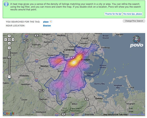
The 'hot' colours are naturally taken to mean areas where there is a high density of pizza outlets (!), and the 'cooler' colours mean a lower density, or incidence, of such establishments.
(If you would like to create your own 'heat map' overlays on Google maps, this Googhle Heat map library may help, though you will need a certain amount of programming ability in order to use it!)
Density maps have come to be widely used for plotting the incidence of crime within city confines, particularly in the larger US cities. See if you can find any examples of such 'crime maps' and post a link back to them in the comments to this post.
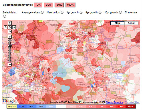
There can also be useful when house hunting - for example, the following Mouseprice house price heat map shows house price inflation in the north of England over between May 2007 and May 2008.
And as if that wasn't enough, several application are now starting to appear that perform population tracking by tracking people's mobile phones (Using Mobile Phones for Time & Motion Studies). This information can then be displayed back to people via their mobile phones so that they can see where the 'hot' places to be are: Citysense: where is everybody?.
As well as being used as overlays on geographical maps, density maps are also widely used to provide reports about website usage. Information can be collected at a crude level based on the links that users click through on a web page to produce a click density map, although it is possible to also track mouse cursor movements, or, in a laboratory setting, eyetracking data.
The following graphic shows the result of aggregated eyetracking data collected from multiple users of the Google website. The hot spots are the places on the page where the users were looking at most.

(Find out more about how the data was collected: Enquiro Develops Google’s Golden Triangle and Eyetools, Enquiro, and Did-it uncover Search's Golden Triangle.)
If you would like to create a click density map for a website you control, there are several services you can try for free. For example: ClickHeat, Crazy Egg and clickdensity. How might heat maps help you improve the usability of a website?
As well as being understand user navigation behaviour on websites, eyetracking heatmaps can also be used to understand better how people read from the screen.
Read F-Shaped Pattern For Reading Web Content. What do the eyetracking results suggest about how people read web pages? How does the visualisation make this behaviour apparent?
As well as reporting 'real world' data, density maps can also be used to visualise the occurrence of events in virtual worlds. For example, online game distributor Bungie provides density maps for the game Halo 3, showing where the 'kill zones' are on various game levels, as measured by the numbers of players who 'died' in each location
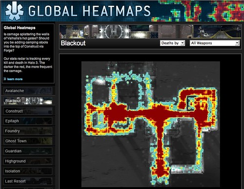
How might this sort of visulisation help game designers improve the playability of their games? What other visulisations might be able to help game designers better understand player behaviour within their games? Write down your ideas, and then see how they compare with what actually happens, as described in this article from Wired magazine: Halo 3: How Microsoft Labs Invented a New Science of Play.
For example, the following map shows a density map of where to find pizza in the US city of Boston.
The 'hot' colours are naturally taken to mean areas where there is a high density of pizza outlets (!), and the 'cooler' colours mean a lower density, or incidence, of such establishments.
(If you would like to create your own 'heat map' overlays on Google maps, this Googhle Heat map library may help, though you will need a certain amount of programming ability in order to use it!)
Density maps have come to be widely used for plotting the incidence of crime within city confines, particularly in the larger US cities. See if you can find any examples of such 'crime maps' and post a link back to them in the comments to this post.
There can also be useful when house hunting - for example, the following Mouseprice house price heat map shows house price inflation in the north of England over between May 2007 and May 2008.
And as if that wasn't enough, several application are now starting to appear that perform population tracking by tracking people's mobile phones (Using Mobile Phones for Time & Motion Studies). This information can then be displayed back to people via their mobile phones so that they can see where the 'hot' places to be are: Citysense: where is everybody?.
As well as being used as overlays on geographical maps, density maps are also widely used to provide reports about website usage. Information can be collected at a crude level based on the links that users click through on a web page to produce a click density map, although it is possible to also track mouse cursor movements, or, in a laboratory setting, eyetracking data.
The following graphic shows the result of aggregated eyetracking data collected from multiple users of the Google website. The hot spots are the places on the page where the users were looking at most.
(Find out more about how the data was collected: Enquiro Develops Google’s Golden Triangle and Eyetools, Enquiro, and Did-it uncover Search's Golden Triangle.)
If you would like to create a click density map for a website you control, there are several services you can try for free. For example: ClickHeat, Crazy Egg and clickdensity. How might heat maps help you improve the usability of a website?
As well as being understand user navigation behaviour on websites, eyetracking heatmaps can also be used to understand better how people read from the screen.
Read F-Shaped Pattern For Reading Web Content. What do the eyetracking results suggest about how people read web pages? How does the visualisation make this behaviour apparent?
As well as reporting 'real world' data, density maps can also be used to visualise the occurrence of events in virtual worlds. For example, online game distributor Bungie provides density maps for the game Halo 3, showing where the 'kill zones' are on various game levels, as measured by the numbers of players who 'died' in each location
How might this sort of visulisation help game designers improve the playability of their games? What other visulisations might be able to help game designers better understand player behaviour within their games? Write down your ideas, and then see how they compare with what actually happens, as described in this article from Wired magazine: Halo 3: How Microsoft Labs Invented a New Science of Play.
Subscribe to:
Posts (Atom)