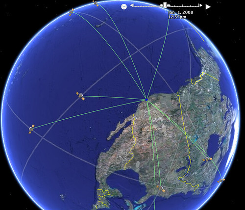
The above image is taken from a visualisation using Google Earth, as described here: Interactive Spiders and Charts. The visualisation also supports an animated view, showing the motion of satellites over a 24 hour period. It's particularly interesting to watch how different satellites come in and out of view of a particular location.
To view the visualisation in Google Earth, Add the following Network Link in Google Earth: GPS Satellite constellation. (If I get a chance, I'll try to put together a page that works in the Google Earth browser extension, and maybe uses Milton Keynes as the focus? An interesting exercise would be to let the user create the KML file that visualises satellites in view for their own location...)
The following movie describes how the GPS system works:
To learn more about GPS, HowStuffWorks has a good intro to How GPS Receivers Work, but for a more detailed view, check out the MIT opencourseware courses GPS: Civilian Tool or Military Weapon? and Modern Navigation.
No comments:
Post a Comment