Another bar chart variant - a grouped bar chart - can be used to compare data from different classes, and at different times, as this example shows:

Try to find a data set that can be sensibly visualised using a grouped bar chart, and create a chart with that data using the Google Chart Generator or within Google Spreadsheets or another online service.
If you found a data set that included several related classes of data collected over many dates, you might find that there are too many bars that can be grouped sensibly.
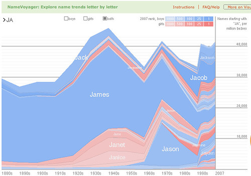
In this case, it might be useful to be visualise the data using a technique that allows for stacked data to be represented using a stacked line graph.
The Baby Name Voyager provides an interactive example of just this approach.

Visit the Baby Name Voyager website and have a play with it. As you do so, try to identify what the underlying data set might be, how it is visualised, and what sorts of interactivity are described. When this website was first released,. it was very popular and attracted a large number of visitors. What different reasons can you think of for why anyone would want to explore the name data using the name voyager?
Now read the following paper about the Baby Name Voyager by its creator, Martin Wattenburg, and see if you can answer the questions that follow below: Baby Names, Visualization, and Social Data Analysis.
- What prompted Wattenburg to create the visualisation?
- Where did the data come from?
- How is the data visualised and what sort of interactivity is provided?
- In your own words, how does Wattenberg describe the notion of "social data analysis"?
- What sorts of "role" does Wattenberg suggest people fall into when socially analysing the data?
1 comment:
Another take on visualising baby name trends can be found at http://nametrends.net/.
How do the visualisation techniques used by Nametrends compare with the technique(s) used on Baby Name Wizard?
Post a Comment