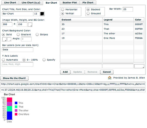
Stacked bar charts display columns (or rows) of data use a single column to display a set of data, and then split the column into segments, with each segment representing a single datum:
The above chart was created using the Google Chart Generator
In general terms, you may choose to label each segment with its proportion (as a percentage) if you need the reader to know the actual percentages involved, rather than just their relative magnitudes as depicted visually.
Some spreadsheets do not 'normalise' the data to percentages, so you may have to do that conversion yourself, in a similar way to finding out the relative proportion of each data set when creating a pie chart by hand.
Stacked bar charts are useful when comparing several different data sets, such as demographic data or market share over a period of years. Rather than trying to compare several pie charts side by side, where the segments may become out of alignment with each other as proportions change, placing several stacked bar charts side by side (for eaxample, one for each year), and ordering the data within each chart in the same way each time, relative changes in proportion can be more easily identified.
No comments:
Post a Comment