How can pie charts be used to mislead the reader of an article or the audience for a presentation? In the above pie charts, which segment has the biggest proportion? Which has the smallest?
Read the following blog post about a presentation given by Apple's Steve Jobs: Distorting data in a presentation?
What is claimed to be misleading about the pie chart referred to? How do you think the deception, if any, was achieved?
There are several things to note about the pie chart referred to in the Steve Jobs presentation. Firstly, it is shown in 3D relief, with the top of the chart pointing away from us - tilting an object can often distort our perception of it, as can the configuration and orientation of the chart (e.g. in the sense of the segment ordering and placement within the chart). Secondly, the segments are coloured - colour selection can also be used to influence perception, as can the choice of which colours are placed next to each other (generally, colours that are brighter or darker than their neighbours will stand out more). Thirdly, the order in which the different manufacturers are listed does not match their rank order in terms of their market share, although it does match the order the items appear going round the pie chart.
Create a pie chart in the proportions used in the Steve Jobs presentation. Using colour selection, segment ordering and/or 3D charts, can you make the chart look more 'truthful'? Can you also make it look more misleading?
(The intention is not to show you how to mislead an audience, but to make you more aware of how other people may use charts to mislead you, whether intentionally, or just through bad design.)
Exploded Pie Charts
Sometimes, the chart designer may wish to emphasise one particular segment of the pie chart. In this case, an exploded pie chart may be used to highlight the segment of interest.
The following example shows an exploded 3D pie chart in the Apple iWorks Keynote presentation editor:
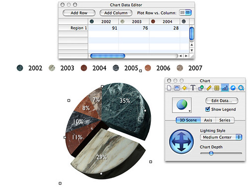
A single segment is simply selected and then pulled away from the rest of the chart to highlight it. You may also notice the 3D navigational control. This allows the chart to be rotated in 3D space so that it can be 'tilted' forwards and backwards ('pitch'), or left to right ('roll') as required.
It is possible to explode (pull out) several segments from the chart, but this tends to lead to confusion and is not to be recommended.
In Google Docs, the Fusion Charts Pie widget allows you to create an interact 3D pie chart that can be embedded in many online documents.
Click on a segment and it will be pulled out of the chart; click on again and it will go back to its original location.
Exploded charts can also be produced using tools such as Excel.
No comments:
Post a Comment