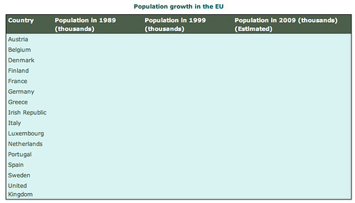
Monday, May 19, 2008

Moving from Bar Charts to Histograms

In An Introduction to Bar Charts, we saw how bar charts could be used to display measures relating to 'discrete' variables on a chart. In this post, we'll consider how a histogram can be used to plot 'continuous' data using discrete 'bars' to represent the data frequency over a particular range of values.

example histogram from openlearn
Pulse-rates of a group of 100 students (from the OpenLearn Unit More working with charts, graphs and tables).

Read Discrete and continuous variables (from the OpenLearn unit More working with charts, graphs and tables).

What continuous and discrete variables did you identify in the final exercise?

Now read both of these OpenLearn sections on histograms: Histograms (from Working with charts, graphs and tables) and Histograms (from More working with charts, graphs and tables).

What are the defining characteristics of a histogram? Write down at least three ways in which a histogram differs from a simple bar chart.

In a histogram, the range of values that define the samples reported by the height of each bar are often referred to as bins. One thing to check when reading a histogram is the bin size used for each of the bars. In most situations, they should all be the same width... Choosing an appropriate "bin size", or "bin width" can often influence the shape of the histogram, as described here: The Histogram (from NetMBA).

In contrast to a bar char, where each bar represents the value of a discrete variable, in a histogram, the height of each bar in a histogram actually represents a frequency count of how many times a value occurs within the bin corresponding to that bar.

A histogram thus shows the distribution of data values across a particular range. The human eye is very good at recognising different distribution pattern shapes, so a histogram is one way of detecting potential anomalies in the distribution of data.

In the next post, we will consider alternative ways of displaying continuous data.

Saturday, May 17, 2008

An Introduction to Bar Charts

In A Round Chart in a Square Hole - Stacked Bar Charts I described a particular type of bar chart known as a stacked bar chart, that may be used like a pie chart to display proportional data.

Bar charts can also be used as a far more general type of graphical display.

Read the following section from the OpenLearn unit More working with charts, graphs and tables: Bar Charts

What sort of data can bar charts be used to visualise? How should you decide whether to use a vertical or a horizontal bar chart?

Bar charts are particulalry effective when you want to compare the relative measures applied to discontinuous or independent categories. For example, if you wanted to compare the relative numbers of subscribers to various broadband suppliers in a particular year, you might represent each supplier by a different bar in the bar chart.

All spreadsheet packages contain wizards that let you create a simple bar chart. for example, the following Google chart is generated from a Google spreadsheet using the data described in the OpenLearn material.


As with many other chart types, a 3D representation is also possible:


It is also often possible to produce stylised bar charts - this is particularly the case in many marketing campaigns.


If you are ever tempted to use such displays, take care to choose an appropriately stylised display, and try not to make it misleading. For example, in the above case, the breaks in each bar where the coaches are coupled together can confuse the eye as it tries to judge the relative attendance proportions for each category.

A Round Chart in a Square Hole - Stacked Bar Charts

In An Introduction to Pie Charts I showed how a pie chart can be used to represent proportion data. Stacked bar charts (also known as divided bar charts) can also be used to provide an alternative way of showing such data.

Stacked bar charts display columns (or rows) of data use a single column to display a set of data, and then split the column into segments, with each segment representing a single datum:

Google Chart

The above chart was created using the Google Chart Generator

Stacked bar chart - google chart generator

In general terms, you may choose to label each segment with its proportion (as a percentage) if you need the reader to know the actual percentages involved, rather than just their relative magnitudes as depicted visually.

Some spreadsheets do not 'normalise' the data to percentages, so you may have to do that conversion yourself, in a similar way to finding out the relative proportion of each data set when creating a pie chart by hand.

Stacked bar charts are useful when comparing several different data sets, such as demographic data or market share over a period of years. Rather than trying to compare several pie charts side by side, where the segments may become out of alignment with each other as proportions change, placing several stacked bar charts side by side (for eaxample, one for each year), and ordering the data within each chart in the same way each time, relative changes in proportion can be more easily identified.

Thursday, May 8, 2008

Misleading the Reader With Pie Charts

In An Introduction to Pie Charts we looked at how to create a simple pie chart - something like the below for example:


How can pie charts be used to mislead the reader of an article or the audience for a presentation? In the above pie charts, which segment has the biggest proportion? Which has the smallest?

Read the following blog post about a presentation given by Apple's Steve Jobs: Distorting data in a presentation?

What is claimed to be misleading about the pie chart referred to? How do you think the deception, if any, was achieved?

There are several things to note about the pie chart referred to in the Steve Jobs presentation. Firstly, it is shown in 3D relief, with the top of the chart pointing away from us - tilting an object can often distort our perception of it, as can the configuration and orientation of the chart (e.g. in the sense of the segment ordering and placement within the chart). Secondly, the segments are coloured - colour selection can also be used to influence perception, as can the choice of which colours are placed next to each other (generally, colours that are brighter or darker than their neighbours will stand out more). Thirdly, the order in which the different manufacturers are listed does not match their rank order in terms of their market share, although it does match the order the items appear going round the pie chart.

Create a pie chart in the proportions used in the Steve Jobs presentation. Using colour selection, segment ordering and/or 3D charts, can you make the chart look more 'truthful'? Can you also make it look more misleading?

(The intention is not to show you how to mislead an audience, but to make you more aware of how other people may use charts to mislead you, whether intentionally, or just through bad design.)

Exploded Pie Charts


Sometimes, the chart designer may wish to emphasise one particular segment of the pie chart. In this case, an exploded pie chart may be used to highlight the segment of interest.

The following example shows an exploded 3D pie chart in the Apple iWorks Keynote presentation editor:

3D chart in keynote

A single segment is simply selected and then pulled away from the rest of the chart to highlight it. You may also notice the 3D navigational control. This allows the chart to be rotated in 3D space so that it can be 'tilted' forwards and backwards ('pitch'), or left to right ('roll') as required.

It is possible to explode (pull out) several segments from the chart, but this tends to lead to confusion and is not to be recommended.

In Google Docs, the Fusion Charts Pie widget allows you to create an interact 3D pie chart that can be embedded in many online documents.


Click on a segment and it will be pulled out of the chart; click on again and it will go back to its original location.
Exploded charts can also be produced using tools such as Excel.

Monday, May 5, 2008

An Introduction to Pie Charts

The first sort of chart we shall look at is a pie chart. You are probably already familiar with the idea of a pie chart - they often appear as illustrations in newspaper stories - but you may not have given much thought as to why they are used in preference to other chart types, or how they are constructed.

As you work through the following two readings, see if you can answer the following questions:
  1. What sort of story does a pie chart tell?

  2. Under what circumstances is it appropriate to use a pie chart? When should a pie chart not be used?

  3. How do you construct a pie chart from a set of tabular data?

How do you read a pie chart? Read the following section from the OpenLearn unit "Working with charts, graphs and tables": Making sense of data - Pie Charts.

When should you use a pie chart, and how do you construct them? Work through the following section from the OpenLearn unit "More working with charts, graphs and tables": Pie Charts.

How can I create My Own Pie Chart?


Pie charts can be created within most, if not all, spreadsheet applications. However, because pie charts only tend too contain a small amount of data, you may find it quicker to use a simple online chart generator.

For example, several chart generators exist that can create a pie chart using the Google charts web service. This service takes the data that is to be plotted in a chart, along with the chart title and labels, in a single URL, and returns an image that plots the data. The URL can be created automatically from a table containing the data, as these two examples show:

It is also possible to create charts on a web page dynamically (that is, automatically) from data contained in a table. The following embed charts that are created by passing data via a URL to a chart generator, which returns the chart image that is embedded in the web page:


Creating Pie Charts in Google Spreadsheets
As with most spreadsheets, a pie chart can be created by highlight two coloums (or rows) from a spreadsheet; one should contain the labels for each segment of the pie chart, the other should contain numnerical data. A pie chart wizard will then typically calculate the proportional sizes of each category and plot the chart accordingly.

(null)

The following widget shows a pie chart created 'in real time' from data contained in a Google spreadsheet:


If the data in the spreadsheet is changed, the pie chart will change accordingly next time the widget is refreshed, or the page containing it is loaded.

Creating Pie Charts in Excel
If you are an Excel user, there are plenty of tutorials available on how to create a pie chart using that application. try searching for "pie chart in excel" using the How Do I? instructional video search, or check out this video (one of many) on Youtube: How to create a pie chart in Excel.

Intermission - Charts Tell Stories

"There is a need to communicate"...

Of the various aims I have for the Visual Gadgets blogged uncourse experiment:

1) to introduce you to various ways of visualising data;
2) to consider how the visualisations "work" in a perceptual way;
3) to demonstrate how to choose what visualisations to use in any particular case; and
4) to show you how to use various tools to create those visulisations

the most important thing to remember is that charts and data are just tools for storytelling...

Watch this, and you'll hopefully see what I mean:


We'll return to Hans Rosling and the Trendalyser animations later, but now, back to the basics - and an introduction to pie charts...

Visualising Tabular Data - Rule Based Cell Highlighting

In Interactive Tables you saw how by making tables interactive it is possible to 'interrogate' the data contained within a table, such as filtering it by row according to the contents of cells contained within a particular column, or by sorting the table according to the value of cells in a particular column. By highlighting rows, columns or individual cells, certain data elements can be emphasised in order to communicate a particular point to the reader of presentation viewer, and so on.

Many spreadsheets also allow you to use rules that can automatically highlight particular cells too.

Highlighting Cell Values


In Google spreadsheets, this is achieved by selecting one or more cells (for example, selecting a column by clicking on the column label (A, B, C etc.)), right clicking on one of the selected cells to pop up a context sensitive menu, and then selecting the Change format with rules option:

change format with rules

The rules allow you to set the colour of the text contained within a cell, or its background, based the value of each cell's contents.

So for example, in the following diagram, I have defined a rule that will change the background colour of every cell in a particular column if the value of a cell is less than 100.

google spreadsheet - change colours on rules dialogue

Why might highlighting cells containing values that fall below - or above - a particular value be preferable to sorting a table and by eye glancing down a particular column to see which rows are sorted above or below the value of interest?

Charting Tables


In many situations, presenting data in tabular form can be just plain bewildering, even with interactive tables. With too much data in a table, the numbers may start to just swim before your eyes and lose all meaning.

Even with simple tables, it might be the case that a visualisation of the data 'explains' the data in a more useful way than just seeing the raw numbers (I'll talk about why in a later post).

So how can we visualise tabular data in a meaningful way? In common with many spreadsheet programmes, Google spreadsheet offers a set of predefined chart times that can be created using a 'wizard':

google spreadsheet charts

In the following posts, we'll look at how bar charts, pie charts, and histograms can be used to visualise tabular data, discussing the reasons behind why we might choose each particular chart type, before going on to consider some more elaborate animated visualisations that truly bring the data alive.

Friday, May 2, 2008

Interactive Tables

In Creating Your First Table you had an opportunity to design a table that would be appropriate for displaying EU population data.

In this post, we'll look at how adding interactivity to a table can help the reader engage with it in an active way, and to a limited extent "interrogate" the data, or ask questions of it.

For example, here is an example of some data collated into a table from the UN World Population prospects database.


The data is actually contained in a Google spreadsheet and then republished via a Google table gadget. That is, the data is being pulled "live" into this web page from a Google spreadsheet.

The table can be filtered so that it will display only those rows containing data items that correspond to the filter terms selected for each column.

The population data table is too simplistic to demonstrate the true usefulness of the column filters. Can you think of an example table where it might be useful to be able to filter the data? What sorts of characteristics would the data in each column have to have for this feature to be truly useful?

Sometimes you may not want to filter out data, just highlight a particular row or column. This form of interactivity is supported by an increasing number of tools, many of which will let you highlight by selection particular rows or columns (or both), and then optionally print them out with the selected rows/columns highlighted.

For example, the Yahoo interface library (YUI) data table control is capable of turning many HTML (web page) data tables into interactive tables capable of row or cell highlighting.

Under what conditions might it be useful to be able to highlight data contained within a table?

In some tables that could potentially contain several columns and many rows, the table designer is faced with the often difficult choice of choosing how to order the contents of a table; for example, what should go in the first row, what should go in the second row, what should go in the last row.

An interactive table, or an interactive table designer, allows the designer of the table to change the ordering of the table contents 'on-the-fly'.

To see an example of what I mean, have a look at this sortable table containing data regarding school sizes and budgets on the Isle of Wight. The contents of the table can be sorted by row according the value of the data elements contained in a particular column. To sort the table by a particular column, click on the column header (that is, the cell at the top of the column that contains the column's name).

Using the interactive sorting feature, see if you can order the table in reverse alphabetical order. Then see if you can identify the school with the largest budget and the school with the second largest population. How many schools do not have an X in the Option 2 column? Without the interactivity, how easy would it have been for you to find out this information from the table?

By what criteria might you choose to order the rows of data contained within table?

What are the advantages and disadvantages of using an interactive table to present tabular data?

In the next post, we will look at how tabular data an be brought alive using a variety of visualisation techniques.

In the meantime, why not get yourself a Google account if you don't already have one, and have a go at creating your own data table gadget?

If you need some data to put in your table, why not reuse some community submitted from Swivel? You can either download data sets from Swivel to your desktop, and then upload them to a Google spreadsheet from your desktop, or you can simply view a complete table on the Swivel site, highlight all the data cells, copy them, click in a single Google spreadsheet cell, and paste - the data should then be copied into the appropriate number of cells in the google spreadsheet.

Alternatively, you can copy and paste data from the Many Eyes data visualisation datasets website.

If you do reuse third party data, please ensure that: a) you have permission to do so; and b) you record where the data came from. Never try to pass other people's data off as your own, always acknowledge the source, and always keep a record of where the data came from in your copy of the document that contains the data.

Thursday, May 1, 2008

Creating Your First Table

In How to Use a Table we looked at what sorts of decisions we need to make when putting together a table. In this post you'll have an opportunity to put what you've learned into practice.

The following material is taken from the OpenLearn Unit More working with charts, graphs and tables, in particular Section 3.2 Tables: Activities:

Grazr


Unfortunately, the table doesn't display properly in the widget above - here's what it should look like:

table outline

In the next post, we'll look at how interactivity can be added to tables so that they can be dynamically reordered by the user to show the same information in several different ways.