Take the following case for example, where we have three items of equal value.
Let's look at the data presented as a three dimensional pyramid:
(You can separate out a segment by clicking on it.)
Although each segment has the same value - is it the height of each slice that is the same, it's base length, the length of it's side, or the volume of each segment that is the same?
See if you can calculate the relative volume of each segment using the equation for the volume of a square based pyramid:
When creating a two dimensional or three dimensional chart, it is important to know what is actually being used to denote the value of the quantity being represented (height, volume, area, etc.).
One of the most important questions, though, is to know what it is that a naive user actually thinks they are being told when they see a 2D or 3D chart?
In the case of the pyramid chart shown above, I don't know how it is being constructed. But does it fairly communicate the notion that each quantity has a similar value?
If instead of a pyramid, the graphic was a two dimensional right angled triangle, with the height representing the value of each item, would it be "fair"?
For example:

What are the relative areas of each item? To what extent does the length of the base - and hence the actual area of each segment, distort your reading of the "right angled triangle chart"?
In the following diagram, the height of each segment is the same, but the areas of different.
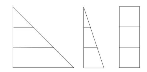
But see how confusing it gets when the area of each segment is exactly the same...?
One thing is certain, 2D and 3D charts are not very good at communicating precise values in an unambiguous way... And if the troublesome 'equivalent area' graphic is anything to go by, it seems as if we cope best when we are just making comparisons based on a single visual dimension.
No comments:
Post a Comment