Watch this short video describing the proof of concept Vizter social network browser visualisation: Vizter explanatory video.
How does vizter allow you to identify friends you have in common with other people? How does vizter help the user identify possible communities in the social graph?
If you have a Facebook account, there are several tools that you can use to visualise your friends network on there (requires adding the visulisation as a Facebook application). Here are some of the tools that I'm aware of:
- Touchgraph frinds'n'photos browser;
- Nexus social graph browser;
- Friendwheel
- Facebook Mutual Friend Network Visualization in Flash
- Friends visulisation in Many Eyes: this application will mine your friends network and produce a data output that will let you visualise your friends network using the Many Eyes network visualisation tool. Note that if you do upload the data to many Eyes, it will be public (that is, it can be see by anyone).
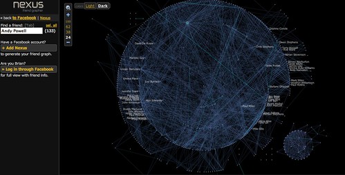
The Nexus application is particularly interesting - here is the graph for one of my (very well connected) friends - Brian Kelly:

There are a couple of things to note about this graph. Firstly, there are two dominant clusters - a large central cluster, and a smaller cluster off to the bottom left. Secondly, I can highlight any individual node in the graph (in this case, Andy Powell) and see which friends they have in common.
Another popular (at the time of writing!) 'online conversation network' is the Twitter microblogging service. Twitter lets you post short messages (up to 140 characters in length) that can be 'streamed' to your friends on that network. (If you don't know what Twitter is, watch this explanation: Twitter in Plain English.)
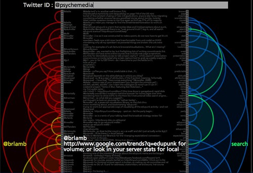
The TwitArcs conversation browser conversation browser allows you to browse your and your friends messages, whilst also seeing what other messages they relate to, by virtue of both authorship and topic.

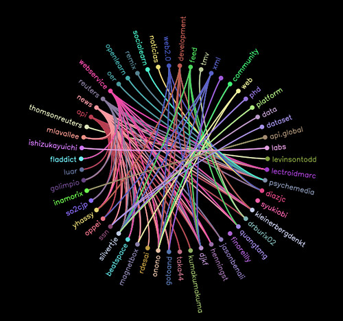
A related technique to highlighting connections can be used in interactive "wheel" type displays. For example, the following image shows how a particular URL that has been bookmarked to the delicious social bookmarking service has been tagged there, and by whom:

Explore the social life on delicious of some URLs you are familiar with using the approach shown above: delicious Tags'n'users Wheel. Are some people more prolific taggers than others? What is the most popular tag used to described the bookmarked URL(s) you visualised? Are some tags more popular than others for describing the URL(s) you selected? How does the visualisation make this evident?
2 comments:
Here's a handy tool for visualising 'fans' networks on the delicious social bookmarking service:
delicious network explorer (Java applet)
Here's a roundup blog post about visualisations built around the twitter microblogging service:
visualising twitter
Post a Comment