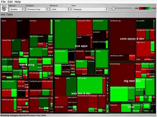
The above treemap shows, at a glance, two sorts of information. Firstly the relative size of the market for different categories of computer books (O'Reilly is one of the best known computer book publishers) - the area of each rectangle reflects the relative sales volume of books in one category compared to the others. Secondly, the chart shows the year on year change in the volume of sales per category by using the dimension of colour.
Do a web or blog search for "State of the Computer Book Market" to find the most recent O'Reilly review of the computer books market. Visit the review page, but before reading the commentary, just look at the treemaps that are presented, and write your own conclusions about what they say about the state of the market. Then read through the commentary and compare the conclusions to your own. How 'intuitive' is the treemap to read?
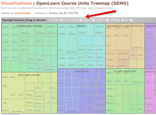
Treemaps are also a great way to explore hierarchically organised data. For example, the following image shows a screenshot from the IBM Many Eyes visualisation service, where I have used a treemap to represent some of the free course units offered by OpenLearn. The uploaded data includes OpenLearn course unit identifiers, the OpenLEarn subject area the units are affered in, the original OU course from which the units were derived, and so on. By rearranging the order of the headers, the treemap can be used to create different hierarchical views over the data.

Visit the OpenLearn Units Treemap (requires Java) and familiarise yourself with how the treemap works. See if you can find any other good examples of treemap visualisations on Many Eyes, and post a link back to them as a comment to this post.
You can also find treemaps as elsewhere on the web. For example, diggGraphr provides a treemap view of new and upcoming stories on the Digg social news site, and is itself reminiscent of this original news map. One of the most compelling treemaps I have found is the Hive Group World Population treemap, which uses data from the CIA factbook to provide a highly intereactive way of exploring world population data.
Read the following Many Eyes description page about Treemaps.See if you can create a treemap from your own data set, either one of your own, one you have discovered on Many Eyes, or one you have located elsewhere. (Take care uploading data to Many Eyes - if uploaded there, it will be made public.)
As well as the 'simple' treemap, Many Eyes can also be used to identify changes in data values in a way reminiscent of the treemaps used in the O'Reilly 'State of the Book Market' reports, using the "Treemap for comparisons" (sometimes referred to a s "change treemap") visualisation.
See if you can find any examples of "change treemaps" on the Many Eyes site, or create your own visualisation of that type using an appropriate data set.
1 comment:
There's a good review of how treemaps work - and what they're good for - on the Eager Eyes blog:
Eager Eyes: Treemaps
Post a Comment