If you are ever in the market for buying a house, it's likely that whenever you get the details for a property it will include at least a 2D hand-drawn sketch of the floor plan of the house.
However, it's increasingly likely that a more professional looking floor plan will have been created using a CAD (computer aided design) floor plan editor, such as the Autodesk labs online drawing tool. (It's possible to share such drawing over the web , so if you have a go at using the Autodesk Labs Draw package to draw a floor plan, please post a link back to it in the comments to this post :-)
2D floor plans are all very well, but there is also an increasing number of tools that make 3D modeling, a technology once only available to professional architects, now available to all-comers.
For example,, SketchUp is a 3D design tool that can be used to create 3D models of buildings (as well as other objects). SketchUp models can be displayed in Google Earth and used in other 3D web applications and virtual worlds.
SketchUp works on Mac and Windows computers and can be downloaded from http://sketchup.google.com/.
It is also possible to model - and view - objects inside building that you have created, as well as creating the buildings themselves.
In true collaborative style, you can share and edit the designs that other people have created by checking them out of the 3D Warehouse.
One very powerful feature of SketchUp is the ability to use a photograph as the basis for a model, as the following movie illustrates:
Download Google SketchUp and have a go at creating your own 3D model. There are lots of video tutorials to help get you started on both the Google SketchUp website and on YouTube. When you have completed your model, why not upload it to the 3D Warehouse, or post a movie of a walkthrough of your model to a video sharing site, with a link back here? :-)
Once you have created a 3D SketchUp model, it can be submitted to the Google Sketchup 3D model warehouse, and then viewed in 3D worlds such as Google Earth. Online applications such as Scenecaster also allow you to reuse models from the SketchUp warehouse as part of an animated 3D walkthrough, as this movie shows.
If you are interested in using SketchUp to create 3D models from 2D floor plans, this set of tutorial videos will show you how:
(Note that if you use the Autocad Labs Draw application cannot directly export drawings in a CAD format that SketchUp can import. However, you can export the plan as an image and load that into SketchUp, where you can trace round it.)
If you do manage to create a 3D model from a floor plan, why not post a link back to the original 2D CAD drawing, and the 3D model you generated from it, as a comment to this post?
Saturday, June 28, 2008
Monday, June 23, 2008
Visual Teaching - GPS Satellite Constellations
When I set up the visual gadgets blog, the intention was to use it to draft out a set of materials about data visualisation. So how about this: visualising data about GPS satellite locations...
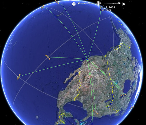
The above image is taken from a visualisation using Google Earth, as described here: Interactive Spiders and Charts. The visualisation also supports an animated view, showing the motion of satellites over a 24 hour period. It's particularly interesting to watch how different satellites come in and out of view of a particular location.
To view the visualisation in Google Earth, Add the following Network Link in Google Earth: GPS Satellite constellation. (If I get a chance, I'll try to put together a page that works in the Google Earth browser extension, and maybe uses Milton Keynes as the focus? An interesting exercise would be to let the user create the KML file that visualises satellites in view for their own location...)
The following movie describes how the GPS system works:
To learn more about GPS, HowStuffWorks has a good intro to How GPS Receivers Work, but for a more detailed view, check out the MIT opencourseware courses GPS: Civilian Tool or Military Weapon? and Modern Navigation.
Judge Every Book By Its Cover...
A new visual front end to the Amazon online bookstore (made possible via the Amazon API) provides a user interface to the store reminiscent of a 'real world' bookshop: Zoomii.
Watch the following video, or visit the Zoomii website. What elements of a 'real world' bookshop does Zoomii try to replicate?
How else might 'real world' metaphors be used to enhance visual shop displays?
One way may be to overlay books on a floorplan/map view, using an approach similar to this interactive office plan.
Tuesday, June 17, 2008
Visual Recipes
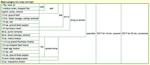
Most people are familiar with the structure of a recipe in a recipe book: a list of ingredients is given, maybe with a cooking time/temperature, followed by a set of 'assembly' instructions for the recipe.
But how about this novel summary table for a recipe from the Cooking for Engineers website? (Cooking for Engineers?! Hear the rationale behind the site from its creator, Michael Chu: Geek Cooking, Debunking Hollywood Science and Green Roofs.)
How does the structure of the table convey "process information" - that is, what steps to take with what ingredients in what order?
Dig out your favourite recipe, and see if you can represent it using the tabular layout, then upload a screengrab of the table and add a link to it as a comment to this post :-)
Friday, June 13, 2008
Visual Thinking Tools
Sometimes, just laying arguments or ideas out in a spatial way can help you see gaps in an argument, or can help you 'walk through' a decision in a structured way (for example, de Bono's "Six Thing Hats®" provides a visual metaphor for considering the different sides of a situation in a decision making process.
Exploratree is a web site that collects together 'visual thinking' templates that can be used to help structure thinking in a visual way.
Visit Exploratree and browse through some of the "thinking guides" that are collected there. See if you can find a thinking guide that would be appropriate for helping you think through the consequences of an action, or "planning back" from some anticipated goal to a current situation. How does the template for a simple exercise such as Plus, Minus, Interesting help you actually perform this exercise? Do the templates require any prior knowledge, or does their visual design implicitly suggest how to use the thingin guide without further instruction? For example, how would you use this template? Compass Rose.
Labels:
thinking guide,
thinking tools,
visual thinking
Market Share - But What's Changed?
I can still remember the first time I saw a treemap - it was in a blog post by book publisher Tim O'Reilly on the Book Sales as a Technology Trend Indicator.
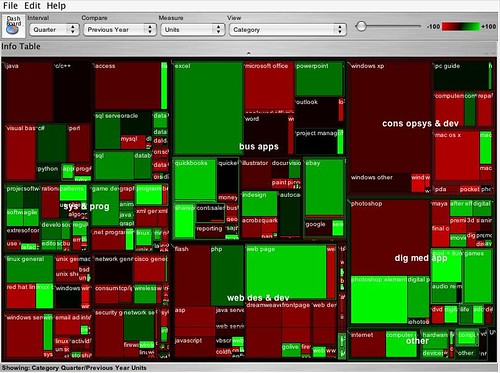
The above treemap shows, at a glance, two sorts of information. Firstly the relative size of the market for different categories of computer books (O'Reilly is one of the best known computer book publishers) - the area of each rectangle reflects the relative sales volume of books in one category compared to the others. Secondly, the chart shows the year on year change in the volume of sales per category by using the dimension of colour.
Do a web or blog search for "State of the Computer Book Market" to find the most recent O'Reilly review of the computer books market. Visit the review page, but before reading the commentary, just look at the treemaps that are presented, and write your own conclusions about what they say about the state of the market. Then read through the commentary and compare the conclusions to your own. How 'intuitive' is the treemap to read?
Treemaps are also a great way to explore hierarchically organised data. For example, the following image shows a screenshot from the IBM Many Eyes visualisation service, where I have used a treemap to represent some of the free course units offered by OpenLearn. The uploaded data includes OpenLearn course unit identifiers, the OpenLEarn subject area the units are affered in, the original OU course from which the units were derived, and so on. By rearranging the order of the headers, the treemap can be used to create different hierarchical views over the data.
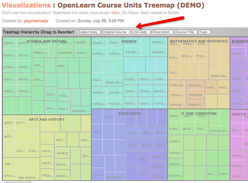
Visit the OpenLearn Units Treemap (requires Java) and familiarise yourself with how the treemap works. See if you can find any other good examples of treemap visualisations on Many Eyes, and post a link back to them as a comment to this post.
You can also find treemaps as elsewhere on the web. For example, diggGraphr provides a treemap view of new and upcoming stories on the Digg social news site, and is itself reminiscent of this original news map. One of the most compelling treemaps I have found is the Hive Group World Population treemap, which uses data from the CIA factbook to provide a highly intereactive way of exploring world population data.
Read the following Many Eyes description page about Treemaps.See if you can create a treemap from your own data set, either one of your own, one you have discovered on Many Eyes, or one you have located elsewhere. (Take care uploading data to Many Eyes - if uploaded there, it will be made public.)
As well as the 'simple' treemap, Many Eyes can also be used to identify changes in data values in a way reminiscent of the treemaps used in the O'Reilly 'State of the Book Market' reports, using the "Treemap for comparisons" (sometimes referred to a s "change treemap") visualisation.
See if you can find any examples of "change treemaps" on the Many Eyes site, or create your own visualisation of that type using an appropriate data set.

The above treemap shows, at a glance, two sorts of information. Firstly the relative size of the market for different categories of computer books (O'Reilly is one of the best known computer book publishers) - the area of each rectangle reflects the relative sales volume of books in one category compared to the others. Secondly, the chart shows the year on year change in the volume of sales per category by using the dimension of colour.
Do a web or blog search for "State of the Computer Book Market" to find the most recent O'Reilly review of the computer books market. Visit the review page, but before reading the commentary, just look at the treemaps that are presented, and write your own conclusions about what they say about the state of the market. Then read through the commentary and compare the conclusions to your own. How 'intuitive' is the treemap to read?
Treemaps are also a great way to explore hierarchically organised data. For example, the following image shows a screenshot from the IBM Many Eyes visualisation service, where I have used a treemap to represent some of the free course units offered by OpenLearn. The uploaded data includes OpenLearn course unit identifiers, the OpenLEarn subject area the units are affered in, the original OU course from which the units were derived, and so on. By rearranging the order of the headers, the treemap can be used to create different hierarchical views over the data.

Visit the OpenLearn Units Treemap (requires Java) and familiarise yourself with how the treemap works. See if you can find any other good examples of treemap visualisations on Many Eyes, and post a link back to them as a comment to this post.
You can also find treemaps as elsewhere on the web. For example, diggGraphr provides a treemap view of new and upcoming stories on the Digg social news site, and is itself reminiscent of this original news map. One of the most compelling treemaps I have found is the Hive Group World Population treemap, which uses data from the CIA factbook to provide a highly intereactive way of exploring world population data.
Read the following Many Eyes description page about Treemaps.See if you can create a treemap from your own data set, either one of your own, one you have discovered on Many Eyes, or one you have located elsewhere. (Take care uploading data to Many Eyes - if uploaded there, it will be made public.)
As well as the 'simple' treemap, Many Eyes can also be used to identify changes in data values in a way reminiscent of the treemaps used in the O'Reilly 'State of the Book Market' reports, using the "Treemap for comparisons" (sometimes referred to a s "change treemap") visualisation.
See if you can find any examples of "change treemaps" on the Many Eyes site, or create your own visualisation of that type using an appropriate data set.
Thursday, June 12, 2008
Feel the Heat
Density maps, or in common parlance, "heat maps", use semi-trasnparent overlays above a map or other image (such as a web page) to show the density (or frequency) of events happening at each point on the underlying map.
For example, the following map shows a density map of where to find pizza in the US city of Boston.
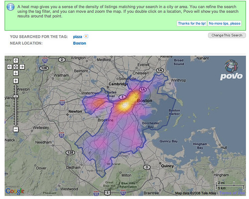
The 'hot' colours are naturally taken to mean areas where there is a high density of pizza outlets (!), and the 'cooler' colours mean a lower density, or incidence, of such establishments.
(If you would like to create your own 'heat map' overlays on Google maps, this Googhle Heat map library may help, though you will need a certain amount of programming ability in order to use it!)
Density maps have come to be widely used for plotting the incidence of crime within city confines, particularly in the larger US cities. See if you can find any examples of such 'crime maps' and post a link back to them in the comments to this post.
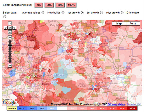
There can also be useful when house hunting - for example, the following Mouseprice house price heat map shows house price inflation in the north of England over between May 2007 and May 2008.
And as if that wasn't enough, several application are now starting to appear that perform population tracking by tracking people's mobile phones (Using Mobile Phones for Time & Motion Studies). This information can then be displayed back to people via their mobile phones so that they can see where the 'hot' places to be are: Citysense: where is everybody?.
As well as being used as overlays on geographical maps, density maps are also widely used to provide reports about website usage. Information can be collected at a crude level based on the links that users click through on a web page to produce a click density map, although it is possible to also track mouse cursor movements, or, in a laboratory setting, eyetracking data.
The following graphic shows the result of aggregated eyetracking data collected from multiple users of the Google website. The hot spots are the places on the page where the users were looking at most.

(Find out more about how the data was collected: Enquiro Develops Google’s Golden Triangle and Eyetools, Enquiro, and Did-it uncover Search's Golden Triangle.)
If you would like to create a click density map for a website you control, there are several services you can try for free. For example: ClickHeat, Crazy Egg and clickdensity. How might heat maps help you improve the usability of a website?
As well as being understand user navigation behaviour on websites, eyetracking heatmaps can also be used to understand better how people read from the screen.
Read F-Shaped Pattern For Reading Web Content. What do the eyetracking results suggest about how people read web pages? How does the visualisation make this behaviour apparent?
As well as reporting 'real world' data, density maps can also be used to visualise the occurrence of events in virtual worlds. For example, online game distributor Bungie provides density maps for the game Halo 3, showing where the 'kill zones' are on various game levels, as measured by the numbers of players who 'died' in each location
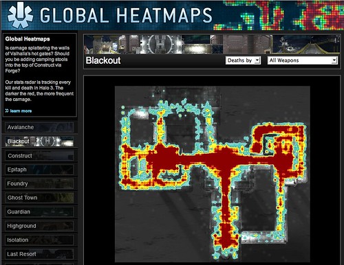
How might this sort of visulisation help game designers improve the playability of their games? What other visulisations might be able to help game designers better understand player behaviour within their games? Write down your ideas, and then see how they compare with what actually happens, as described in this article from Wired magazine: Halo 3: How Microsoft Labs Invented a New Science of Play.
For example, the following map shows a density map of where to find pizza in the US city of Boston.

The 'hot' colours are naturally taken to mean areas where there is a high density of pizza outlets (!), and the 'cooler' colours mean a lower density, or incidence, of such establishments.
(If you would like to create your own 'heat map' overlays on Google maps, this Googhle Heat map library may help, though you will need a certain amount of programming ability in order to use it!)
Density maps have come to be widely used for plotting the incidence of crime within city confines, particularly in the larger US cities. See if you can find any examples of such 'crime maps' and post a link back to them in the comments to this post.
There can also be useful when house hunting - for example, the following Mouseprice house price heat map shows house price inflation in the north of England over between May 2007 and May 2008.

And as if that wasn't enough, several application are now starting to appear that perform population tracking by tracking people's mobile phones (Using Mobile Phones for Time & Motion Studies). This information can then be displayed back to people via their mobile phones so that they can see where the 'hot' places to be are: Citysense: where is everybody?.
As well as being used as overlays on geographical maps, density maps are also widely used to provide reports about website usage. Information can be collected at a crude level based on the links that users click through on a web page to produce a click density map, although it is possible to also track mouse cursor movements, or, in a laboratory setting, eyetracking data.
The following graphic shows the result of aggregated eyetracking data collected from multiple users of the Google website. The hot spots are the places on the page where the users were looking at most.

(Find out more about how the data was collected: Enquiro Develops Google’s Golden Triangle and Eyetools, Enquiro, and Did-it uncover Search's Golden Triangle.)
If you would like to create a click density map for a website you control, there are several services you can try for free. For example: ClickHeat, Crazy Egg and clickdensity. How might heat maps help you improve the usability of a website?
As well as being understand user navigation behaviour on websites, eyetracking heatmaps can also be used to understand better how people read from the screen.
Read F-Shaped Pattern For Reading Web Content. What do the eyetracking results suggest about how people read web pages? How does the visualisation make this behaviour apparent?
As well as reporting 'real world' data, density maps can also be used to visualise the occurrence of events in virtual worlds. For example, online game distributor Bungie provides density maps for the game Halo 3, showing where the 'kill zones' are on various game levels, as measured by the numbers of players who 'died' in each location

How might this sort of visulisation help game designers improve the playability of their games? What other visulisations might be able to help game designers better understand player behaviour within their games? Write down your ideas, and then see how they compare with what actually happens, as described in this article from Wired magazine: Halo 3: How Microsoft Labs Invented a New Science of Play.
Scripting Diagrams
Oftentimes, one of the hardest things to do when constructing a visual representation is getting the layout of the diagram right. However, many visualisation tools incorporate layout engines that take care of all that hard work for you - just provide a textual description (albeit in a structured way) and the visulisation tool will generate the diagram (sometimes even an interactive diagram) for you.
For example, Graphviz is an open source graph visulisation toolkit that construct visual representations of mathematical graphs from a textual description of the graph. (You can see a wide range of examples of the sorts of thing that Graphviz can do in the Graphviz gallery).
Let's have a quick look at how we can create a couple of graphs in Graphviz.
Firstly, consider this tree diagram.
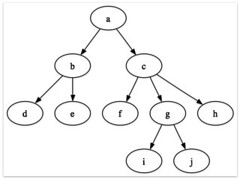
How long do you think it would take you to draw and layout a diagram similar to that? How much effort would be involved if you wanted to change the labels, or add another node or two to the hierarchy?
Using Graphviz, it took me maybe 5 minutes to "script" the tree, and then just a few seconds for Graphviz to display it for me (I actually used a Mac based interface to Graphviz from which I captured the diagram).
Here's how I described the tree to Graphviz:
How about a more complicated diagram?
Or maybe even one like this?
Try to create some of your own graphs using Graphviz. As well as the 'simple' views I have shown above, you can also script far more complex diagrams, include the use of colour, and so on. One of the best ways of learning how to enrich your own diagrams is to look through the Graphviz gallery, find a graph that displays a feature or effect that you would like to use, click through to the gallery page for that graph and then click on the graph image to 'view source' of the script that was used to generate the graph. Inspection of it should reveal how to create the required effect.
For example, Graphviz is an open source graph visulisation toolkit that construct visual representations of mathematical graphs from a textual description of the graph. (You can see a wide range of examples of the sorts of thing that Graphviz can do in the Graphviz gallery).
Let's have a quick look at how we can create a couple of graphs in Graphviz.
Firstly, consider this tree diagram.

How long do you think it would take you to draw and layout a diagram similar to that? How much effort would be involved if you wanted to change the labels, or add another node or two to the hierarchy?
Using Graphviz, it took me maybe 5 minutes to "script" the tree, and then just a few seconds for Graphviz to display it for me (I actually used a Mac based interface to Graphviz from which I captured the diagram).
Here's how I described the tree to Graphviz:
 | digraph G { a -> b; a -> c; b -> d; b -> e; c -> f; c -> g; c -> h; g -> i; g -> j; } |
How about a more complicated diagram?
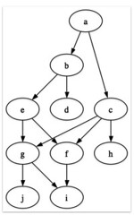 | digraph G { a -> b; a -> c; b -> d; b -> e; c -> f; e -> f; c -> g; c -> h; g -> i; g -> j; f -> i; e -> g; } |
Or maybe even one like this?
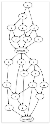 | digraph G { a -> b; a -> c; b -> d; b -> e; c -> f; e -> f; c -> g; c -> h; d -> g e -> inevitable1; f -> inevitable1; g -> inevitable1; h -> inevitable1; inevitable1 -> i; inevitable1 -> j; inevitable1 -> k; i -> l; j -> m; j -> n; k -> n; l-> o; k-> o; j-> p; l -> q; n -> r; p -> s; m -> t; s -> t; s -> o; o -> r; q -> inevitable2; r -> inevitable2; s -> inevitable2; t -> inevitable2; } |
Try to create some of your own graphs using Graphviz. As well as the 'simple' views I have shown above, you can also script far more complex diagrams, include the use of colour, and so on. One of the best ways of learning how to enrich your own diagrams is to look through the Graphviz gallery, find a graph that displays a feature or effect that you would like to use, click through to the gallery page for that graph and then click on the graph image to 'view source' of the script that was used to generate the graph. Inspection of it should reveal how to create the required effect.
Mapping Social Networks
The growth of social networks such as Facebook and MySpace has introduced the idea of the 'social graph' into common parlance. the social graph is
Watch this short video describing the proof of concept Vizter social network browser visualisation: Vizter explanatory video.
How does vizter allow you to identify friends you have in common with other people? How does vizter help the user identify possible communities in the social graph?
If you have a Facebook account, there are several tools that you can use to visualise your friends network on there (requires adding the visulisation as a Facebook application). Here are some of the tools that I'm aware of:
The Nexus application is particularly interesting - here is the graph for one of my (very well connected) friends - Brian Kelly:
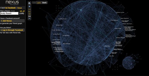
There are a couple of things to note about this graph. Firstly, there are two dominant clusters - a large central cluster, and a smaller cluster off to the bottom left. Secondly, I can highlight any individual node in the graph (in this case, Andy Powell) and see which friends they have in common.
Another popular (at the time of writing!) 'online conversation network' is the Twitter microblogging service. Twitter lets you post short messages (up to 140 characters in length) that can be 'streamed' to your friends on that network. (If you don't know what Twitter is, watch this explanation: Twitter in Plain English.)
The TwitArcs conversation browser conversation browser allows you to browse your and your friends messages, whilst also seeing what other messages they relate to, by virtue of both authorship and topic.
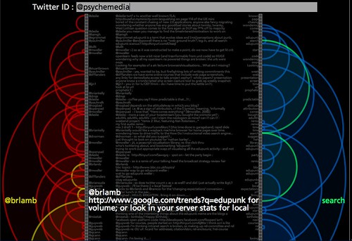
A related technique to highlighting connections can be used in interactive "wheel" type displays. For example, the following image shows how a particular URL that has been bookmarked to the delicious social bookmarking service has been tagged there, and by whom:
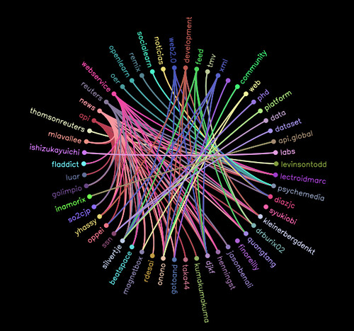
Explore the social life on delicious of some URLs you are familiar with using the approach shown above: delicious Tags'n'users Wheel. Are some people more prolific taggers than others? What is the most popular tag used to described the bookmarked URL(s) you visualised? Are some tags more popular than others for describing the URL(s) you selected? How does the visualisation make this evident?
Watch this short video describing the proof of concept Vizter social network browser visualisation: Vizter explanatory video.
How does vizter allow you to identify friends you have in common with other people? How does vizter help the user identify possible communities in the social graph?
If you have a Facebook account, there are several tools that you can use to visualise your friends network on there (requires adding the visulisation as a Facebook application). Here are some of the tools that I'm aware of:
- Touchgraph frinds'n'photos browser;
- Nexus social graph browser;
- Friendwheel
- Facebook Mutual Friend Network Visualization in Flash
- Friends visulisation in Many Eyes: this application will mine your friends network and produce a data output that will let you visualise your friends network using the Many Eyes network visualisation tool. Note that if you do upload the data to many Eyes, it will be public (that is, it can be see by anyone).
The Nexus application is particularly interesting - here is the graph for one of my (very well connected) friends - Brian Kelly:

There are a couple of things to note about this graph. Firstly, there are two dominant clusters - a large central cluster, and a smaller cluster off to the bottom left. Secondly, I can highlight any individual node in the graph (in this case, Andy Powell) and see which friends they have in common.
Another popular (at the time of writing!) 'online conversation network' is the Twitter microblogging service. Twitter lets you post short messages (up to 140 characters in length) that can be 'streamed' to your friends on that network. (If you don't know what Twitter is, watch this explanation: Twitter in Plain English.)
The TwitArcs conversation browser conversation browser allows you to browse your and your friends messages, whilst also seeing what other messages they relate to, by virtue of both authorship and topic.

A related technique to highlighting connections can be used in interactive "wheel" type displays. For example, the following image shows how a particular URL that has been bookmarked to the delicious social bookmarking service has been tagged there, and by whom:

Explore the social life on delicious of some URLs you are familiar with using the approach shown above: delicious Tags'n'users Wheel. Are some people more prolific taggers than others? What is the most popular tag used to described the bookmarked URL(s) you visualised? Are some tags more popular than others for describing the URL(s) you selected? How does the visualisation make this evident?
Wednesday, June 11, 2008
Graphs and Networks
Many large datasets contain data that describes the relationship, or connection, between two or more entities contained within the data set, and many tools are now available for plotting graphs and network diagrams when presented with data that has been structures in a suitable manner.
(A graph is a mathematical structure that can be used to describe these connections in a formal, and easily represented way. In a graph, 'nodes' are connected to each other by 'edges' in either a directed way (a link that goes from one node to another, but not vice versa, such as "A is the parent of B') or an undirected way (the relationship is 'symmetrical' - the M1 motorway connects Leeds to London, and equally connects London to Leeds).)
For example, the IBM Many Eyes visualisation toolkit has a network diagram visualisation that will plot when presented with a set of paired data elements.
Read more detail about the Many Eyes network diagram visualisation, in particular paying attention to how the data must be formatted to work with the visualisation. Create your own dummy data set - or find some data elsewhere that can be suitably arranged - and visualise it using the Many Eyes network diagram visualisation. Does the 'emergent' visualised structure tell you anything interesting about the data?
The length of the connections (edges) between the nodes is not necessarily indicative of anything, and may just be an artefact of the algorithm that lays out the graph.
Here is a map of the internet, circa 2003 that shows the connections between different internet routers.

Watching an animated visulisation of internet maps over time show just how quickly the internet is growing: Cheswick/Burch Map of the Internet, created as part of the Internet Mapping Project (Bell Labs/Lumeta Corporation).
Maps like this can be crudely constructed (in a time consuming way) by using tools such as traceroute that track the routes taken by data packets as they travel between internet addresses.
(There are many traceroute tools available, mostly as downloadable applications that will track, and plot the route taken by) data packets from your computer to other internet connected devices. Some online services will also display a traceroute map of the route followed by data from your computer to their service, and their service to another internet address. If you would like to see an example of this, try using a service such as Visual Trace Route or mapulator.)
(For a historical view of internet connectivity visulisations, see the now lapsed Cybergeography atlas.)
(A graph is a mathematical structure that can be used to describe these connections in a formal, and easily represented way. In a graph, 'nodes' are connected to each other by 'edges' in either a directed way (a link that goes from one node to another, but not vice versa, such as "A is the parent of B') or an undirected way (the relationship is 'symmetrical' - the M1 motorway connects Leeds to London, and equally connects London to Leeds).)
For example, the IBM Many Eyes visualisation toolkit has a network diagram visualisation that will plot when presented with a set of paired data elements.
Read more detail about the Many Eyes network diagram visualisation, in particular paying attention to how the data must be formatted to work with the visualisation. Create your own dummy data set - or find some data elsewhere that can be suitably arranged - and visualise it using the Many Eyes network diagram visualisation. Does the 'emergent' visualised structure tell you anything interesting about the data?
The length of the connections (edges) between the nodes is not necessarily indicative of anything, and may just be an artefact of the algorithm that lays out the graph.
Here is a map of the internet, circa 2003 that shows the connections between different internet routers.

Watching an animated visulisation of internet maps over time show just how quickly the internet is growing: Cheswick/Burch Map of the Internet, created as part of the Internet Mapping Project (Bell Labs/Lumeta Corporation).
Maps like this can be crudely constructed (in a time consuming way) by using tools such as traceroute that track the routes taken by data packets as they travel between internet addresses.
(There are many traceroute tools available, mostly as downloadable applications that will track, and plot the route taken by) data packets from your computer to other internet connected devices. Some online services will also display a traceroute map of the route followed by data from your computer to their service, and their service to another internet address. If you would like to see an example of this, try using a service such as Visual Trace Route or mapulator.)
(For a historical view of internet connectivity visulisations, see the now lapsed Cybergeography atlas.)
Visual Presentations
Many people in business and education have to frequently sit through presentations where wordy documents are cut and pasted onto slides and thrown at an audiences through a projected Powerpoint presentation:
Another, more effective, approach is to use a presentation to tell a story in a slightly more visual way, as the following slideshow demonstrates.
Note that this sort of presentation works with or without actually seeing the presentation delivered live - and hearing what the presenter has to say.
Sometimes it may be that the presenter effectively enters into a conversation with the presentation, or becomes part of a double act with it, where both the presentation, and the spoken presentation, are required to get the full message.
At other times, the presenter doesn't explicitly refer to any slides, even though they may be there...
Alternatively, the presenter may 'create' the visuals as they deliver their talk:
Watch enough of the above videos to get a feel for the presentational style ion each case, then look through some of the presentations on Slideshare, and some of the presentation reviews on the Presentation Zen (posts tagged "delivery"). How do these new styles of presentation compare with the more typical, even "traditional" style of presentation as ridiculed in the first video in this post?
Topological Maps (Graphs By Another Name)
Although many people think of a line graph when they hear the word "graph", the success of online social networking sites such as Facebook, MySpace and Bebo has popularised another use of the word, in the sense of "the social graph".
This actually makes reference to a mathematical structure known as a graph, a network like structure that describes how sets of points (more correctly referred to as nodes) are connected to other points (i.e. other nodes) by edges that describe some relationship (or relation) between them.
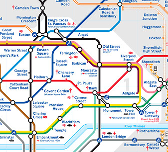
One of the most widely know graphs is the graph of the London Underground (which also just happens to be a topological map - that is, a map with all the superfluous information (relative to the task at hand) removed from it:
As with the Periodic Table of Chemical Elements, so recognisable is this visual representation and the 'visual literacy' conventions it has established, that its design ideas have been widely adopted elsewhere.
Here are a couple of amusing examples I have found:
See if you can find examples of other maps or visualisations that resemble the style London Underground map (the websites for other major transit systems are a good place to start). Link back to any examples you find with a comment to this post.
The 'fluidity' of the topographical map - the nodal points (e.g. the tube stations on the London Underground map) can 'move around' the map to a position where they 'look right', rather than having to necessarily conform to their exact geographical location. (For example, here is a 'true' map of the London Underground that does respect geography: 'true' map of the London Underground; and here's a 'real' London Tube Map overlaid on a map of London.).
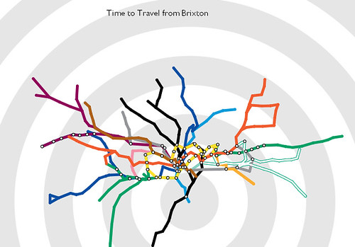
The topological nature of the London Tube map means that it can be 'reflowed' or 'transformed' to provide a focus + context display representation (as used in hyperbolic tree displays, for example), to provide a view of the map centred around any particular tube station.
As an example of a such a focus + context display, one enterprising designer has constructed an interactive tube map, with any tube station at the centre, that transforms the map so that it shows the travel time to other stations from the station of interest.
Try the interactive travel time tube map. What different sorts of information does this map convey?
Video Infographics
One of the areas of visualisation that is starting to impact on us every day is the area of infographics ("information graphics"). Infographics are visual representations of information that communicate that information to "readers" at a glance, although increasingly information graphics are starting to rely on their 'readers' having a certain degree of 'visual literacy', in the sense of being able to understand the conventions that the infographic may be using to frame its design.
Take for example the following infographic from the 1970s. Write down the story that you think this plaque tells.

If you knew that the plaque was mounted on a spacecraft (NASA's Pioneer 10 and Pioneer 11 interplanetary explorers from the 1970s) as an 'interplanetary calling card', would the plaque have told you a different story? What story would that be?
For a good reading of the plaque, see: The Pioneer Plaque (Wikipedia).
As well as 'fixed image' infographics, the increasing availability of simple video production tools and the explosion in online video (where viewers are happy to graze on short, 3-5 minute self-contained video programmes) has resulted in the appearance of short 'video infographics'.
These combine visual storytelling with 'animated text' to make certain key points explicit.
Here is one of my favourite 'video infographics':
How do the graphical elements communicate or reinforce the factual information that the video is presenting.
See if you can find any other examples of this sort of video storytelling; provide a link back to any relevant videos you find as a comment to this post.
Take for example the following infographic from the 1970s. Write down the story that you think this plaque tells.

If you knew that the plaque was mounted on a spacecraft (NASA's Pioneer 10 and Pioneer 11 interplanetary explorers from the 1970s) as an 'interplanetary calling card', would the plaque have told you a different story? What story would that be?
For a good reading of the plaque, see: The Pioneer Plaque (Wikipedia).
As well as 'fixed image' infographics, the increasing availability of simple video production tools and the explosion in online video (where viewers are happy to graze on short, 3-5 minute self-contained video programmes) has resulted in the appearance of short 'video infographics'.
These combine visual storytelling with 'animated text' to make certain key points explicit.
Here is one of my favourite 'video infographics':
How do the graphical elements communicate or reinforce the factual information that the video is presenting.
See if you can find any other examples of this sort of video storytelling; provide a link back to any relevant videos you find as a comment to this post.
Tuesday, June 10, 2008
Spotting Gaps - The Periodic Table
No treatment of visualisation can get away without mentioning Mendeleev's periodic table of chemical elements (briefly summarised in the section Chemical Periodicity from the OpenLearn Unit The Molecular World, and seen in its historical context in Mendeleev's Lecture to the Royal Society on "The Periodic Law of the Chemical Elements").
The table lays out the chemical elements according to their physical and chemical properties, arranging the elements so that elements with similar properties appear in the same column of the table.
Read this Brief History of the Periodic table, or watch this explanation about the construction of The Periodic Table. Why is Mendeleev's periodic table of the chemical elements rightly seen as a prime example of the power of visualisation tools?
The structure of the table - 'groups' of elements arranged by column, 'periods' by row - manages to reflect something of the internal structure of the elements, and allows us to visualise 'similarity' (the number of free electrons) and 'progression' (increasing atomic weight) relations across the elements. At the time of its publication, the table also contained many gaps where Mendeleev expected to find elements with particular properties, but knew of no such elements. By virtue of their location in the table, these gaps essentially provided predictions about the physical and chemical properties of as yet (at the time) undiscovered elements. The table thus provided an "observer's guide" for the experimentalists seeking these new elements.
The Periodic Table of Chemical Elements has also provided a rich source of inspiration for many designers.
Have a look at three or four different renderings of the periodic table, either from the above list, or versions you have discovered elsewhere, and write down how their similarities and differences. Do they communicate the same information, or do they offer different glimpses into the lives of the elements? Do any of the renderings manage to communicate the same information, but in different ways? Give an example.
As an act of homage to this great visualisation, the visual layout of the table has also been used to create a periodic table of visualisation methods.
You can see the table here: A Periodic Table of Visualization Methods.
To what extent, if any, does this table make use of the idea of "columnar groups" and "periodic rows" to make explicit similarities and relationships between the different visualisation types?
The table lays out the chemical elements according to their physical and chemical properties, arranging the elements so that elements with similar properties appear in the same column of the table.
Read this Brief History of the Periodic table, or watch this explanation about the construction of The Periodic Table. Why is Mendeleev's periodic table of the chemical elements rightly seen as a prime example of the power of visualisation tools?
The structure of the table - 'groups' of elements arranged by column, 'periods' by row - manages to reflect something of the internal structure of the elements, and allows us to visualise 'similarity' (the number of free electrons) and 'progression' (increasing atomic weight) relations across the elements. At the time of its publication, the table also contained many gaps where Mendeleev expected to find elements with particular properties, but knew of no such elements. By virtue of their location in the table, these gaps essentially provided predictions about the physical and chemical properties of as yet (at the time) undiscovered elements. The table thus provided an "observer's guide" for the experimentalists seeking these new elements.
The Periodic Table of Chemical Elements has also provided a rich source of inspiration for many designers.
- an interactive periodic table;
- Interactive periodic table, showing the physical state of each element at room pressure and different temperatures;
- a visual interpretation of each of the elements. Do you think it would be easier to memorise the table based on this representation of it?
- demonstrates the different electron arrangements for each element;
- a simple interactive view
- showing a picture of each element
Have a look at three or four different renderings of the periodic table, either from the above list, or versions you have discovered elsewhere, and write down how their similarities and differences. Do they communicate the same information, or do they offer different glimpses into the lives of the elements? Do any of the renderings manage to communicate the same information, but in different ways? Give an example.
A Periodic Table of Visualisation Methods
As an act of homage to this great visualisation, the visual layout of the table has also been used to create a periodic table of visualisation methods.
You can see the table here: A Periodic Table of Visualization Methods.
To what extent, if any, does this table make use of the idea of "columnar groups" and "periodic rows" to make explicit similarities and relationships between the different visualisation types?
So What Are They Talking About?
The recent growth in popularity of 'user generated content' and the almost universal provision of 'user tagging' of content - associating video or photo uploads, or bookmarked URLs, with informal keyword metadata (that is, tags) - has led to the widespread appearance on the web of weighted lists, more commonly referred to as tag clouds.
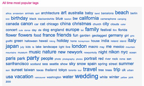
The size of each word in the tag cloud is proportional to the frequency of the word in some particular corpus. This might be the number of items in a collection that have been tagged in a particular way, or it might be the result of a word count or content analysis over full text documents.
Where tag clouds are used to provide a navigational summary of user generated content, clicking on a tag in the cloud will typically lead to a 'tag results' page listing (like a search engine results page listing) with links to all the pages that use that tag. In the case of the tag cloud shown above, a screensahot of the tags page on the flickr photo sharing site, clicking on a tag will tag you to an 'image results' page showing thumbnails of the photographs tagged with that particular term.
The IBM Many Eyes visualisation application provides a suite of tools for analysing data sets and visualising in various ways. One of the tools is the Many Eyes tag cloud/text analyser, that will analyse textual data sets to produce a tag cloud visualisation.
For example, some time ago I uploaded a data set containing the titles, tags and descriptions of a set of OpenLearn open courseware units, and generated a tag cloud that allowed me to see a quick summary of the topics that were covered on OpenLearn at the time. You can see the tag cloud here: OpenLearn tag cloud (via Many Eyes).
As well as Many Eyes, there are many online tag cloud generators that can generate tag clouds from blocks of raw text, uploaded files, HTML pages (given their URL) or RSS feeds. TagCrowd is one such application, Zomclouds another. A web search search for something like tag cloud generator is likely to turn up many more.
Using one of the services referred to above, or one that you have found yourself, experiment with creating different tag clouds from different blocks of text. Does the visualisation provide a good 'summary' of the text? If you use delicious, flickr, or any other site that supports user tagging and tag clouds, look at your own tag cloud. Does it give a fair summary of the content you have tagged?
Visualisation - Mind's Eye Thinking
Although many visualisation techniques employ graphical devices for the display of information, visualisation may also be used to invoke 'visual metaphors' that can help invoke particular ways of thinking; sometimes, these metaphors may have little or no literal connection at all to the invoked image, or they may have an entirely arbitrary connection. It does help if they are memorable, though!
Take for example de Bono's "Six Thinking Hats®" method for invoking parallel thinking about a topic or decision, as described in the video below:
What are the colours of the Six Thinking Hats®, and to what sorts of thinking does each relate? To what extent do the colours invoke the corresponding style of thinking in a natural, 'visually evocative' way?
Would the style of thinking for each hat be as effective if the colours were matched to thinking styles in a different way?
Making Use of Structure: Hierarchical trees
Many data sets contain within them - either explicitly or implicitly - a set of structural relations between different parts of the data set.
One common way of structuring data is in the form of a hierarchy, or 'family tree'. Typical examples are organisational charts, library classification schemes, or the "phylogenetic tree of life", the Linnaean classification scheme that categorises the evolution of different forms of life.

Hierarchical trees are also widely as the basis of mindmapping tools, where 'child' ideas are developed off a central core topic. If you have never used a mindmapping tool, they can provide a very good way of helping you 'unpack' or explore an idea. Freemind is an excellent hierarchical mindmapping tool that runs as a desktop application on all major operating systems. If you prefer to use online tools, Mindmeister is worth looking at, as are bubbl.us and mindomo.
One of the problems with displaying hierarchies is that they can get very large - and hard to display - very quickly.
There are several ways around this problem. For example, the Tree of Life website, displays a single level within a single branch of the tree on each web page; you can browse the tree here: Tree of Life.
Another approach is to use an interactive visualisation that 'collapses' each branch of the tree, hiding the sub-branches until you want to see them. In this sense, hierarchical organisations can also be thought of as containing 'sets of boxes within boxes'!
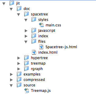
You may already be familiar with this sort of approach from your computer - many file browsers offer a hierarchical visualisation of file organisation through 'neseted folders'.
Another good example of this sort of visualisation is provided by the "JIT visualisation toolkit": large, random "space tree" example.
Clicking on a node toggles it from a 'collapsed' to an 'exploded' state. The path that has been taken through the tree is also highlighted. Although the 'child' branches of only one node can be displayed within each level, the approach does allow the user to explore the tree in a very 'space efficient' manner.
However, some times, it is useful to be able to see the 'full' hierarchy all in one go. One of the most efficient ways of doing this is to use a 'radial tree view', that plots the centre of the tree at the centre of a circle, with the child branches radiating out from it:

Again, the JIT toolkit provides an interactive example of this approach: JIT radial tree example.
A "hyperbolic tree" viewer takes the idea of a radial tree view and runs with, providing a dynamic way of recentering the view with the node of the tree you are interested in at the centre of the diagram.
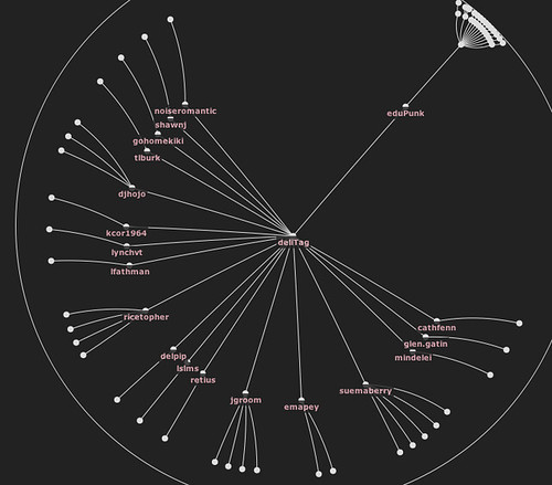
In this example, 'edupunk' is the actual root of the tree, and 'delitag' is one of its two child nodes, that is currently the focus of attention.
The hyperbolic tree visualisation is explained in this video clip from 1995, around about the time the technique was developed: Hyperbolic Tree Browser -- 1995.
If you like to get a 'feel' for how the hyperbolic tree visualisation works, you can find an example here: JIT hyperbolic tree example.
One common way of structuring data is in the form of a hierarchy, or 'family tree'. Typical examples are organisational charts, library classification schemes, or the "phylogenetic tree of life", the Linnaean classification scheme that categorises the evolution of different forms of life.

Hierarchical trees are also widely as the basis of mindmapping tools, where 'child' ideas are developed off a central core topic. If you have never used a mindmapping tool, they can provide a very good way of helping you 'unpack' or explore an idea. Freemind is an excellent hierarchical mindmapping tool that runs as a desktop application on all major operating systems. If you prefer to use online tools, Mindmeister is worth looking at, as are bubbl.us and mindomo.
One of the problems with displaying hierarchies is that they can get very large - and hard to display - very quickly.
There are several ways around this problem. For example, the Tree of Life website, displays a single level within a single branch of the tree on each web page; you can browse the tree here: Tree of Life.
Another approach is to use an interactive visualisation that 'collapses' each branch of the tree, hiding the sub-branches until you want to see them. In this sense, hierarchical organisations can also be thought of as containing 'sets of boxes within boxes'!
You may already be familiar with this sort of approach from your computer - many file browsers offer a hierarchical visualisation of file organisation through 'neseted folders'.
Another good example of this sort of visualisation is provided by the "JIT visualisation toolkit": large, random "space tree" example.
Clicking on a node toggles it from a 'collapsed' to an 'exploded' state. The path that has been taken through the tree is also highlighted. Although the 'child' branches of only one node can be displayed within each level, the approach does allow the user to explore the tree in a very 'space efficient' manner.
However, some times, it is useful to be able to see the 'full' hierarchy all in one go. One of the most efficient ways of doing this is to use a 'radial tree view', that plots the centre of the tree at the centre of a circle, with the child branches radiating out from it:

Again, the JIT toolkit provides an interactive example of this approach: JIT radial tree example.
A "hyperbolic tree" viewer takes the idea of a radial tree view and runs with, providing a dynamic way of recentering the view with the node of the tree you are interested in at the centre of the diagram.

In this example, 'edupunk' is the actual root of the tree, and 'delitag' is one of its two child nodes, that is currently the focus of attention.
The hyperbolic tree visualisation is explained in this video clip from 1995, around about the time the technique was developed: Hyperbolic Tree Browser -- 1995.
If you like to get a 'feel' for how the hyperbolic tree visualisation works, you can find an example here: JIT hyperbolic tree example.
Visual Interfaces for Audio/Visual Transcripts
Providing visual interfaces to audio recordings is an area that has started to see considerable innovation.
An increasing number of audio recordings produced for education, as well as government, have transcripts made available for them, often as a requirement to make the materials accessible (in the sense of disability access). But what is the best way of using transcripts to enhance the delivery of audio/visual content?
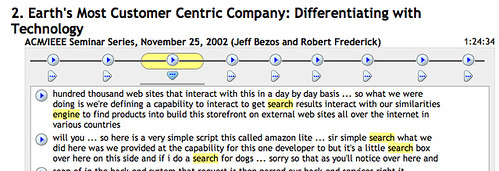
The MIT Lecture Browser provides a way of searching for MIT lectures and then viewing the recordings alongside a synchronised transcript that highlights each word as it is said.
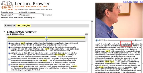
The search tool also identifies all the sections of the lecture that contain the search term and allows you to view the appropriate part of the transcript, as well as being able to start playing the video at that point in the lecture.
The search terms are located within the chunked (by speaker) visual representation of the transcript by the little horizontal black lines (which are reminiscent of word underlines). Hovering a mouse cursor over any block pops up a transcript of what was being said 'in' that block.
Use the MIT lecture browser to find one or more lectures on a topic that is of interest to you. To what extent do the visual cues in the search results (for example, identifying where in the transcript a search term appears) allow you to judge whether you want to listen to a lecture in full, or just visit one or two key parts of it?
In November 2007, the New York Times published an interactive visualisation of a Republican Party Debate: Republican Debate: Analyzing the Details. The visual interface contained two parts: a transcript of the video, that played along with the video; and a 'transcript analyser' that visualised the debate in terms of contributions from each speaker (that is, when they were speaking, and also what they were speaking about). A search tool with the transcript analyzer also allows you to visualise when a particular word was mentioned throughout the debate as a whole, and the amount of time spent talking about that topic:
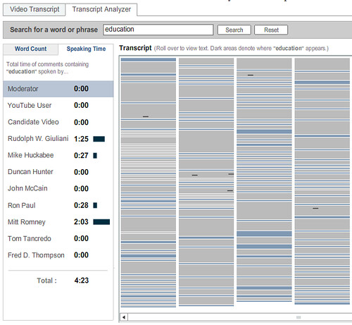
Who spoke longest on the topic of education. By using the Republican Debate: Analyzing the Details visualisation, how many times did each speaker mention the word 'education'? Who spoke most about "policy"? What "policy" were they talking about? How easy would it have been to find references to "policy" in the video transcript view? How easy is it to find those references in the video having had access to the transcript analyzer?
What are the similarities and differences between the MIT Lecture Browser and the New York Times Debate Analysis/transcript viewer tools?
(You can hear the devlopers of the New York Times debate analyser/transcript viewer talk about it's evolution here: Jon Udell's Interviews with Innovators: "Enhancing Online News Content", Shan Carter & Gabriel Dance, Graphics Editor & Senior Multimedia Producer, New York Times.)
Another approach to transcript visualisation is offered as part of the meeting analysis tools that are provided as part of the Open University's online flashmeeting video meeting/conferencing application, which augments free online video conferencing with instant messenging/chat tools, voting tools and a 'my hand's up, I want to talk next' tool.

The creators of the tool claim that "We can also visualise the shape of a meeting linearly or as a polar area diagram, showing the type of meeting and the participant roles. Due to different communication patterns in different kinds of meetings, we have observed a range of meeting event types, such as peer-to-peer or moderated project meetings, interviews, seminars, web-casts and video lectures. Also, different attendee roles can be observed, such as peers, moderators or leaders and lurkers."
This is one area where graphical tools become particularly powerful as visualisation tools. That is, they help us visually recognise (that is, literally 'see') structure that is otherwise implicitly hidden within an activity.
Read this short article by the flashmeeting team on Meeting visualisations. Severa; 'meeting dominance' charts are mentioned in the article. How do these differ visually for the various meeting types (interview, seminar, moderated meeting, and so on)? To what extent does each meeting type seem have its own unique visual signature? That is, given a dominance chart, do you think you could identify which meeting type it referred to?
The final audio/visual transcript tool I'd like to consider is the Video speed matching tool from MySociety. This tool has been designed to allow website visitors to help align UK Parliamentary transcripts from Hansard with video footage of UK Parliament debates.
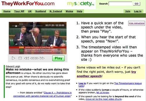
Visit the Video speed matching tool and match one or two of the videos to the transcript. How might "They Work For You" be able to use the data you have collected for them to provide a visualisation tool for UK Parliamentary debates? Is there any other "data" you could easily collect that could provide further visualisation opportunities (and what might those opportunities be?)
An increasing number of audio recordings produced for education, as well as government, have transcripts made available for them, often as a requirement to make the materials accessible (in the sense of disability access). But what is the best way of using transcripts to enhance the delivery of audio/visual content?
The MIT Lecture Browser provides a way of searching for MIT lectures and then viewing the recordings alongside a synchronised transcript that highlights each word as it is said.

The search tool also identifies all the sections of the lecture that contain the search term and allows you to view the appropriate part of the transcript, as well as being able to start playing the video at that point in the lecture.

The search terms are located within the chunked (by speaker) visual representation of the transcript by the little horizontal black lines (which are reminiscent of word underlines). Hovering a mouse cursor over any block pops up a transcript of what was being said 'in' that block.
Use the MIT lecture browser to find one or more lectures on a topic that is of interest to you. To what extent do the visual cues in the search results (for example, identifying where in the transcript a search term appears) allow you to judge whether you want to listen to a lecture in full, or just visit one or two key parts of it?
In November 2007, the New York Times published an interactive visualisation of a Republican Party Debate: Republican Debate: Analyzing the Details. The visual interface contained two parts: a transcript of the video, that played along with the video; and a 'transcript analyser' that visualised the debate in terms of contributions from each speaker (that is, when they were speaking, and also what they were speaking about). A search tool with the transcript analyzer also allows you to visualise when a particular word was mentioned throughout the debate as a whole, and the amount of time spent talking about that topic:

Who spoke longest on the topic of education. By using the Republican Debate: Analyzing the Details visualisation, how many times did each speaker mention the word 'education'? Who spoke most about "policy"? What "policy" were they talking about? How easy would it have been to find references to "policy" in the video transcript view? How easy is it to find those references in the video having had access to the transcript analyzer?
What are the similarities and differences between the MIT Lecture Browser and the New York Times Debate Analysis/transcript viewer tools?
(You can hear the devlopers of the New York Times debate analyser/transcript viewer talk about it's evolution here: Jon Udell's Interviews with Innovators: "Enhancing Online News Content", Shan Carter & Gabriel Dance, Graphics Editor & Senior Multimedia Producer, New York Times.)
Another approach to transcript visualisation is offered as part of the meeting analysis tools that are provided as part of the Open University's online flashmeeting video meeting/conferencing application, which augments free online video conferencing with instant messenging/chat tools, voting tools and a 'my hand's up, I want to talk next' tool.

The creators of the tool claim that "We can also visualise the shape of a meeting linearly or as a polar area diagram, showing the type of meeting and the participant roles. Due to different communication patterns in different kinds of meetings, we have observed a range of meeting event types, such as peer-to-peer or moderated project meetings, interviews, seminars, web-casts and video lectures. Also, different attendee roles can be observed, such as peers, moderators or leaders and lurkers."
This is one area where graphical tools become particularly powerful as visualisation tools. That is, they help us visually recognise (that is, literally 'see') structure that is otherwise implicitly hidden within an activity.
Read this short article by the flashmeeting team on Meeting visualisations. Severa; 'meeting dominance' charts are mentioned in the article. How do these differ visually for the various meeting types (interview, seminar, moderated meeting, and so on)? To what extent does each meeting type seem have its own unique visual signature? That is, given a dominance chart, do you think you could identify which meeting type it referred to?
The final audio/visual transcript tool I'd like to consider is the Video speed matching tool from MySociety. This tool has been designed to allow website visitors to help align UK Parliamentary transcripts from Hansard with video footage of UK Parliament debates.

Visit the Video speed matching tool and match one or two of the videos to the transcript. How might "They Work For You" be able to use the data you have collected for them to provide a visualisation tool for UK Parliamentary debates? Is there any other "data" you could easily collect that could provide further visualisation opportunities (and what might those opportunities be?)
Monday, June 9, 2008
Animation - Not Just For Numerical Data
As well as using software like the Trendalyser/Google Motion Chart (Moving with the times) to animate numerical data, it's also possible to use animation techniques to illustrate change in textual documents.
For example, each page in Wikipedia, the wiki powered online encyclopedia, has a History page associated with it that records each change that has been made the article page. By moving through each historical page, and recording the journey, we can create a movie that shows how a page evolved over time.
Watch Jon Udell's Heavy Metal Umlaut: The movie which illustrates the evolution of the Heavy metal umlaut page on Wikipedia.
(This mode of presentation is interesting as a visual communication technique in its own right. Known as screencasting, the idea is to record a screen capture video and provide narration over the top. The approach was popularised by Jon Udell, who used it widely in his blog (see What is screencasting? for an early explanation of the technique, and Heavy Metal Umlaut: The Making of the Movie for a "howto" about how Jon Udell actually made the screencast shown above). Several screencapture tools are now available - my favourite is Jing, from Camtasia (who also develop several other screen capture applications.)
The wikipedia animation allows readers to familiarise themselves with what page updates have happened (and when) in a natural and intuitive way. So let's think for a moment about what the animation is doing. If you have a look at the Heavy Metal umlaut history page, you will see how it provides a list of links to pages that represent the state of the page after each edit, along with the ability to compare two different pages. If you do try to compare two different pages, you will see that the differences are actually highlighted in quite an unfriendly way that is not likely to be very useful for the average reader!
To step between historical wikipedia pages, Udell used a script that had been developed as part of a Wikipedia animation contest. This script essentially 'clicked through' each hisotorical page whilst displaying the main article page. (Note that a more recent version of the wikipedia animation script highlights the changes that have been made to the page [CHECK].)
Another entry in the animation competition actually used a timeline to display when changes had been made, providing a visualisation about when bursts of editing activity had taken place: AniWIki.
Can you think of any circumstances where you might find a wiki animation tool useful? What are the three most important visualisation features would you require it to have?
Moving With The Times
One of the most attractive features of many computer based visualisations is the ability to animate visual representations and see how they change over time.
Watch the following presentation by Hans Rosling:
Who ever thought a statistics talk could double up as a live performance? But did you notice what sorts of techniques Hans Rosling used to explain the story that the animated data was telling?
Read Six Simple Techniques for Presenting Data: Hans Rosling (TED, 2006), which analyses Rosling's presentation, and in particular how he works with the visualisation, to narrate the stories the data tells, and then watch the video again. Even if you never have to give a 'live' presentation about data, you may still be able to invoke some of the techniques if you ever have to provide a written explanation about a data set.
The Trendalyzer application works best with multidimensional sets of continuous numerical data collected over a long period of time (that is, longitudinal data sets). Such data is often found in the social sciences - as Rosling's talk suggests.
How does the Trendalyser animation help you spot correlations - or anomalies - in the data presented? How does the visualisation manage to communicate changes in several variables at once (and how many variables can it describe at the same time)?
If you would like to 'play' with the Trendalyzer visualisation tool that Rosling demonstrated, and the UN data he visualised with it, you can find it here: Gapminder World. You might notice that the application actually provides different 'views' over the data - either as a chart against (user selected) numerical axes, or overlaid on a map.
You can create your own Trendalyser animated displays by using a Google "Motion Chart" gadget.
Labels:
animation,
gapminder,
motion chart,
trendalyser
A Time for Everything...
As well as calendar dates, another 'human scale' use of time relates to ordering notable historical events as timelines. At their simplest, timelines are just list of dates, in historical order, describing the evolution of some consistent theme over months, years, centuries, or even geological ages.
Timelines can be represented either as a simple, 'ranked' ordered list (that is, just a list of items one after the other, the first event first, then the second, then the third), or alongside an 'absolute' time based scale that represents each date alongside a continuous time axis.
In the first case, there is no real attention paid to the interval between events: so three events happening within the course of a week, one event per line, might be followed by another event on the very next line that happened several months, or even years, later.
In the second case, placing the events against the time axis allows events that happened close to each other in time to be represented close to each other in spatial terms, too.
Interactive timelines, as described in this blog post on oneTimeLine and the BBC British History Timeline, typically use the second approach.
If you would like to create your own timeline, there are several sites that offer 'hosted' timeline creation services, and that allow you to embed the resulting interactive timeline widgets in your own web pages: timeline creation tools.
There are also several timeline widgets that allow you to import the timeline data via an RSS or JSON syndication feed: timeline widgets.
A Time and a Place for Everything
Suppose you worked for an events promotion company, and you were asked to publish the tour dates and locations for a national band tour in a graphical way. What information would need to be displayed? What is the most natural way to display that information?
Some information collections, such as calendar data (event dates), or geographical data (event locations), are often displayed as textual information, although they do have a 'natural' graphical representation - as a calendar, in the case of dates, or on a map, for locations.
It is now relatively easy to create online maps and calendars that can be embedded in your own web pages, captured and converted to document formats that preserve layout information (such as the PDF document type) or printed off directly from the web browser or desktop application.
For example, here is a map displaying all the Open University regional offices (click on a logo/marker to see information about each one):
View Larger Map
(The map and the overlay markers are both pulled into the page as 'live' information.)
Calendars can be embedded in web pages too, typically using either a monthly, weekly or even daily calendar style, or as a list ('agenda' style).
It is even possible to take data from a calendar, and use the location information to plot the calendar events on a map, as this blog post describes: Displaying Google Calendar Events on a Map.
One of the easiest ways to plot location data onto a map is to add it as an overlay. That is, as a visualisation layer that sits on top of the actual map image layer.
The data is pulled in to the map using a data format that can encode geographical location information, such as the latitude and longitude of a point, and maybe its altitude above sea level.
One standard that has come to the fore in recent times is KML, once known as the "Keyhole Markup Language" and originally designed for the Keyhole 3D geographical visualisation tool that has become Google Earth. KML is capable of representing lines and complex polygons (that is, complex 2D and 3D shape overlays), as well as adding image overlays and carrying payloads (such as HTML and embedded video players) into geo-visualisation tools.
At the other extreme, geoRSS is a lightweight, emergent standard that extends the RSS syndication protocol with latitude and longitude co-ordinate. Many online mapping tools accept geoRSS, which means that web publishers who publish their content via RSS feeds already can also push that content into a map based display, if appropriate.
A good example of a site that supports this is flickr, the online photo sharing site, which allows users to add location metadata to their photographs describing the location they were taken. This information can then be exposed via geoRSS, or the flickr API, and used to create displays such as flickrvision, which plots recently uploaded photos on a map.
A simple way of creating your own map overlays is to use a service such as Google MyMaps.
Some information collections, such as calendar data (event dates), or geographical data (event locations), are often displayed as textual information, although they do have a 'natural' graphical representation - as a calendar, in the case of dates, or on a map, for locations.
It is now relatively easy to create online maps and calendars that can be embedded in your own web pages, captured and converted to document formats that preserve layout information (such as the PDF document type) or printed off directly from the web browser or desktop application.
For example, here is a map displaying all the Open University regional offices (click on a logo/marker to see information about each one):
View Larger Map
(The map and the overlay markers are both pulled into the page as 'live' information.)
Calendars can be embedded in web pages too, typically using either a monthly, weekly or even daily calendar style, or as a list ('agenda' style).
It is even possible to take data from a calendar, and use the location information to plot the calendar events on a map, as this blog post describes: Displaying Google Calendar Events on a Map.
Plotting Map Data
One of the easiest ways to plot location data onto a map is to add it as an overlay. That is, as a visualisation layer that sits on top of the actual map image layer.
The data is pulled in to the map using a data format that can encode geographical location information, such as the latitude and longitude of a point, and maybe its altitude above sea level.
One standard that has come to the fore in recent times is KML, once known as the "Keyhole Markup Language" and originally designed for the Keyhole 3D geographical visualisation tool that has become Google Earth. KML is capable of representing lines and complex polygons (that is, complex 2D and 3D shape overlays), as well as adding image overlays and carrying payloads (such as HTML and embedded video players) into geo-visualisation tools.
At the other extreme, geoRSS is a lightweight, emergent standard that extends the RSS syndication protocol with latitude and longitude co-ordinate. Many online mapping tools accept geoRSS, which means that web publishers who publish their content via RSS feeds already can also push that content into a map based display, if appropriate.
A good example of a site that supports this is flickr, the online photo sharing site, which allows users to add location metadata to their photographs describing the location they were taken. This information can then be exposed via geoRSS, or the flickr API, and used to create displays such as flickrvision, which plots recently uploaded photos on a map.
A simple way of creating your own map overlays is to use a service such as Google MyMaps.
When Areas and Volumes are Misleading...
With ever more powerful computers, it gets ever easier to create rich, three dimensional graphics... but as soon as you invoke the second or third dimension in a graphical view of data, it can become misleading.
Take the following case for example, where we have three items of equal value.
Let's look at the data presented as a three dimensional pyramid:
(You can separate out a segment by clicking on it.)
Although each segment has the same value - is it the height of each slice that is the same, it's base length, the length of it's side, or the volume of each segment that is the same?
See if you can calculate the relative volume of each segment using the equation for the volume of a square based pyramid:
b%5E2h)
When creating a two dimensional or three dimensional chart, it is important to know what is actually being used to denote the value of the quantity being represented (height, volume, area, etc.).
One of the most important questions, though, is to know what it is that a naive user actually thinks they are being told when they see a 2D or 3D chart?
In the case of the pyramid chart shown above, I don't know how it is being constructed. But does it fairly communicate the notion that each quantity has a similar value?
If instead of a pyramid, the graphic was a two dimensional right angled triangle, with the height representing the value of each item, would it be "fair"?
For example:

What are the relative areas of each item? To what extent does the length of the base - and hence the actual area of each segment, distort your reading of the "right angled triangle chart"?
In the following diagram, the height of each segment is the same, but the areas of different.
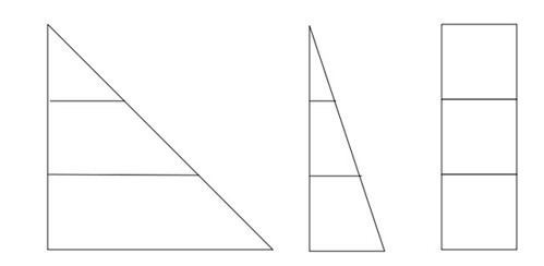
But see how confusing it gets when the area of each segment is exactly the same...?
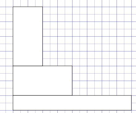
One thing is certain, 2D and 3D charts are not very good at communicating precise values in an unambiguous way... And if the troublesome 'equivalent area' graphic is anything to go by, it seems as if we cope best when we are just making comparisons based on a single visual dimension.
Take the following case for example, where we have three items of equal value.
Let's look at the data presented as a three dimensional pyramid:
(You can separate out a segment by clicking on it.)
Although each segment has the same value - is it the height of each slice that is the same, it's base length, the length of it's side, or the volume of each segment that is the same?
See if you can calculate the relative volume of each segment using the equation for the volume of a square based pyramid:
When creating a two dimensional or three dimensional chart, it is important to know what is actually being used to denote the value of the quantity being represented (height, volume, area, etc.).
One of the most important questions, though, is to know what it is that a naive user actually thinks they are being told when they see a 2D or 3D chart?
In the case of the pyramid chart shown above, I don't know how it is being constructed. But does it fairly communicate the notion that each quantity has a similar value?
If instead of a pyramid, the graphic was a two dimensional right angled triangle, with the height representing the value of each item, would it be "fair"?
For example:

What are the relative areas of each item? To what extent does the length of the base - and hence the actual area of each segment, distort your reading of the "right angled triangle chart"?
In the following diagram, the height of each segment is the same, but the areas of different.

But see how confusing it gets when the area of each segment is exactly the same...?

One thing is certain, 2D and 3D charts are not very good at communicating precise values in an unambiguous way... And if the troublesome 'equivalent area' graphic is anything to go by, it seems as if we cope best when we are just making comparisons based on a single visual dimension.
Line Graphs - How Quickly Things Change
In Plotting Lines..., we introduced the idea of line graphs and in A Matter of Scale: Using Line Charts for Quantity Conversion suggested how they might be used to provide a graphical tool for converting values across different measurement scales.
The other main way of using line graphs is to show how one or more quantities change over time. The OpenLearn unit Exploring distance time graphs looks in some detail at one particular class of time based line graph, that is, the distance time graph, which plots the distance travelled by an object from a starting point against the time spent travelling from that point.
If you read through all of section 7 from that unit (starting with 7.1 Modeling a Journey: Introduction and finishing with 7.12: Distance-time graphs: summing up), you will see how the "steepness" of the graph at any point - that is, it's gradient - describes the speed at that time (that is, if the measure the slope of a distance-time graph, it tells us the speed the object was travelling at, at that time).
This sort of makes sense in a visual way too: the steepness of the slope (gradient) of the graph at any point shows how quickly things were changing at that point.
If you take a bird's eye view of a point riding along the graph, you can really get a feel for what the gradient is telling you about how thing might go in the future...
For example, here is visualisation showing how house prices changed in the UK from 1953 to 2006, where the average house price for each year is depicted as the height above ground of a rollercoaseter track - and you're riding on it...
To my mind, the movie expresses very well the different rates of change in house price inflation (and depreciation) over that time... and what's more, now you have that "visualisation" in mind, you don't necessarily need to generate and watch rollercoaster movies for other line graphs in order to invoke the visualisation - you can do it in mind's eye just by looking at the gradient of the graph...
A Matter of Scale: Using Line Charts for Quantity Conversion
One of the ways of using a line chart is for converting values between different measurement scales.
For example, in old recipe books, you may sometimes see conversion charts that have an imperial measurement (e.g. ounces) on one axis, and a metric quantity described on the other.
The chart line then plots out equivalent values on each scale.
To find out more about using line charts in this way, read all of Section 3 Graphical conversions from the the OpenLearn unit Exploring distance time graphs.
Plotting Lines...
In An Introduction to Pie Charts and An Introduction to Bar Charts I showed some of the most commonly used ways of presenting discrete data in a graphical form.
In Moving from Bar Charts to Histograms, we saw how the graphical form used to display a bar chart could also be used to illustrate a continuous data set.
In many cases, however, it is more appropriate to use a 'line chart' or 'line graph' to display a set of continuous data, such as the value of a particular quantity as it changes over time.
For example, the following chart shows how the volume of people searching Google for different terms over a period of time using the Google Trends service:
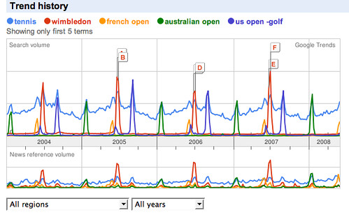
What does the above chart tell you? (Ignore the labels A-F). What story does the chart tell you about the annual tennis calendar?
Read this OpenLearn section on line graphs: Line Graphs (from More working with charts, graphs and tables). Why is Google Trends chart not necessarily a good example of how to present a line graph?
Now read through activities 5 and 6 from the same unit: Line graphs: Activities. Activity uses a
Use the Google chart generator to display the charts, or copy the data into a spreadsheet and use a chart tool to create the line graphs. You will need to use a different approach for each chart. For example, in the Google Chart generator, you should use an "x,y line graph" for Activity 6 and you could "line graph" for Activity 7. Can you explain why?
In Moving from Bar Charts to Histograms, we saw how the graphical form used to display a bar chart could also be used to illustrate a continuous data set.
In many cases, however, it is more appropriate to use a 'line chart' or 'line graph' to display a set of continuous data, such as the value of a particular quantity as it changes over time.
For example, the following chart shows how the volume of people searching Google for different terms over a period of time using the Google Trends service:

What does the above chart tell you? (Ignore the labels A-F). What story does the chart tell you about the annual tennis calendar?
Read this OpenLearn section on line graphs: Line Graphs (from More working with charts, graphs and tables). Why is Google Trends chart not necessarily a good example of how to present a line graph?
Now read through activities 5 and 6 from the same unit: Line graphs: Activities. Activity uses a
Use the Google chart generator to display the charts, or copy the data into a spreadsheet and use a chart tool to create the line graphs. You will need to use a different approach for each chart. For example, in the Google Chart generator, you should use an "x,y line graph" for Activity 6 and you could "line graph" for Activity 7. Can you explain why?
Subscribe to:
Comments (Atom)
