In Moving from Bar Charts to Histograms, we saw how the graphical form used to display a bar chart could also be used to illustrate a continuous data set.
In many cases, however, it is more appropriate to use a 'line chart' or 'line graph' to display a set of continuous data, such as the value of a particular quantity as it changes over time.
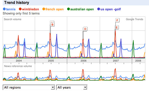
For example, the following chart shows how the volume of people searching Google for different terms over a period of time using the Google Trends service:

What does the above chart tell you? (Ignore the labels A-F). What story does the chart tell you about the annual tennis calendar?
Read this OpenLearn section on line graphs: Line Graphs (from More working with charts, graphs and tables). Why is Google Trends chart not necessarily a good example of how to present a line graph?
Now read through activities 5 and 6 from the same unit: Line graphs: Activities. Activity uses a
Use the Google chart generator to display the charts, or copy the data into a spreadsheet and use a chart tool to create the line graphs. You will need to use a different approach for each chart. For example, in the Google Chart generator, you should use an "x,y line graph" for Activity 6 and you could "line graph" for Activity 7. Can you explain why?
1 comment:
A couple of other things are worth pointing out about the Google trend graph.
Firstly, we can use it to compare the behaviour of different trends. In the case of tennis tournaments, this is maybe not so interesting.
But how about these correlated trends? When do you buy flowers?
(See more examples at Trendspotting)
Another thing to notice is that the chart make the periodicity of certain events obvious - and maybe when they are missing? For example, in which year did Glastonbury Festival take a break?
Post a Comment